The chosen dataset contains over 2.2 million residential real estate listings from across the United States, collected from Realtor.com in 2024 and organized by state and zipcode. Each record includes property details such as listing status, price, number of bedrooms and bathrooms, lot size (acre_lot), house size (living area in square feet), and location information (city, state, zip_code). The data includes both current listings and recently sold homes, making it suitable for housing price prediction and analysis of how property attributes and location relate to price.
Since each listing includes the state in which the property is located, I added publicly available state-level political affiliation data to the dataset. This allows me to examine potential patterns or differences in housing prices across states with different political leanings, adding another layer of context to the analysis.
Goal
The goal of this project is to develop a regression model that predicts house prices based on their features and current market trends. Since the current dataset does not capture all factors that affect house pricing, the model is intended only to assist real estate agents in setting fair and competitive listing prices. The intended workflow is:
The realtor enters a new property’s features (e.g., number of bedrooms, bathrooms, living area, location, etc.)
The model outputs a predicted price based on the trained dataset.
The realtor can then adjust the suggested price further based on factors not captured in the dataset.
Data Preprocessing
Load data
Code
import pandas as pdimport numpy as npimport seaborn as snsimport matplotlib.pyplot as pltimport xgboost as xgbimport optunaimport warningswarnings.filterwarnings("ignore", message="IProgress not found")# Hide warning outputimport osos.environ["XGBOOST_DISABLE_STDOUT_REDIRECTION"] ="1"os.environ["XGBOOST_PLUGINS"] =""
/nix/store/3h9ki7gg02mrkaln0dfdqymqzhwixwv4-python3-3.12.11-env/lib/python3.12/site-packages/tqdm/auto.py:21: TqdmWarning:

IProgress not found. Please update jupyter and ipywidgets. See https://ipywidgets.readthedocs.io/en/stable/user_install.html
It seems reasonable to keep all data points between the 0.1st and 99th percentiles based on how extreme the percent changes are from the mean. On the upper end, including houses up to around 6 bedrooms makes sense because the model performs best on “normal” homes rather than extreme luxury properties.
On the lower end, the 0.1st percentile includes a home priced at about $19,900. Given that different states have very different housing markets, using roughly $20k as a practical minimum does not seem unreasonable.
Overall, the justification for outlier removal in this project is not particularly strict, so trimming values above the 99th percentile and below the 0.1st percentile is unlikely to harm model performance in any meaningful way.
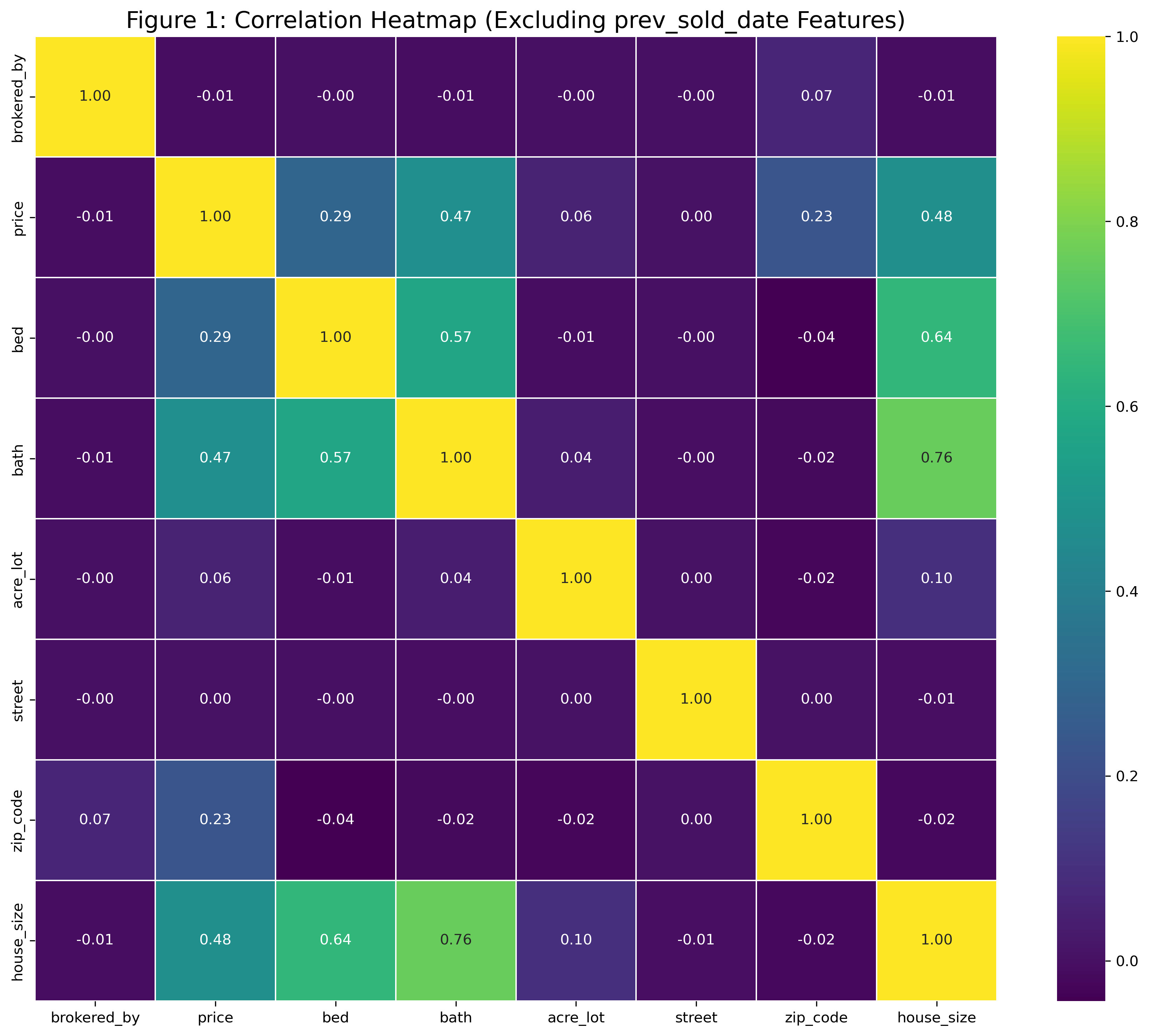
df_eda = df3.copy()numeric_df = df_eda.select_dtypes(include=["number"])numeric_df = numeric_df.drop(columns=[c for c in numeric_df.columns if c.startswith("psd_")])corr = numeric_df.corr()plt.figure(figsize=(12, 10))sns.heatmap( corr, annot=True, fmt=".2f", cmap="viridis", linewidths=0.5)plt.title("Figure 1: Correlation Heatmap \ (Excluding prev_sold_date Features)",fontsize=16)plt.tight_layout()plt.show()
The correlation heatmap (Figure 1) above was created to get a general sense of which features are most related to house price. The results showed that house size, number of bedrooms, and number of bathrooms had the strongest relationships with price. Therefore, the visualizations will focus on these three features.
State Level Housing Market Comparison
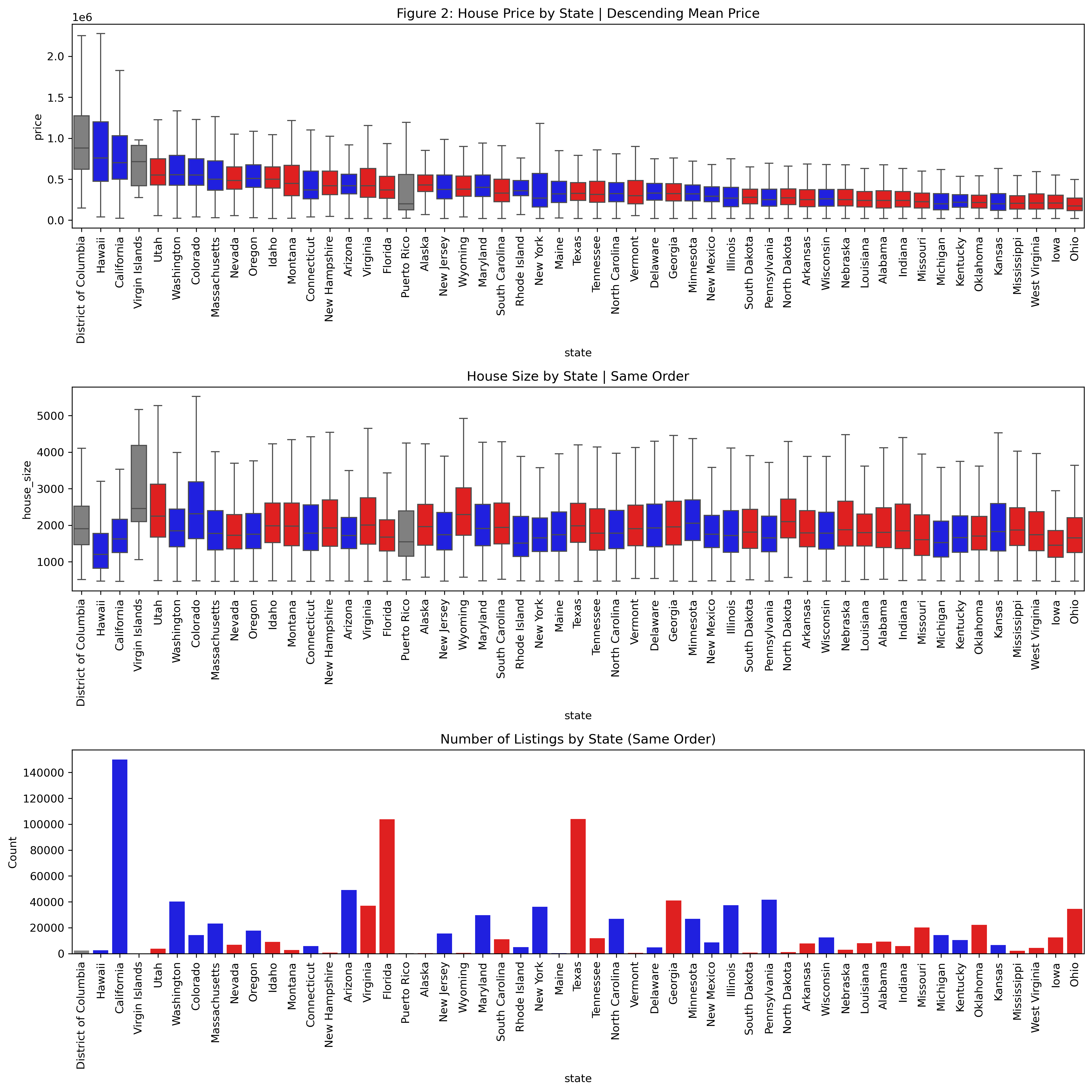
Ordered by Average Price
Code
warnings.filterwarnings("ignore", category=FutureWarning)# Party color mapparty_colors = {"Democrat": "blue","Republican": "red","Other": "gray"}# Compute ordering based on mean price (descending)state_order = ( df_eda.groupby("state")["price"] .mean() .sort_values(ascending=False) .index)# Compute countsstate_counts = df_eda["state"].value_counts().reindex(state_order)# Create per-state color mappingstate_party = ( df_eda.drop_duplicates("state") .set_index("state")["party"] .reindex(state_order))color_map =dict(zip( state_order, state_party.map(party_colors).fillna("gray") ))n =1plt.figure(figsize=(14*n, 14*n))# Priceplt.subplot(3, 1, 1)sns.boxplot( data=df_eda, x="state", y="price", order=state_order, showfliers=False, hue="state", palette=color_map, legend=False)plt.title("Figure 2: House Price by State | Descending Mean Price")plt.xticks(rotation=90)# House Sizeplt.subplot(3, 1, 2)sns.boxplot( data=df_eda, x="state", y="house_size", order=state_order, showfliers=False, hue="state", palette=color_map, legend=False)plt.title("House Size by State | Same Order")plt.xticks(rotation=90)# Countsplt.subplot(3, 1, 3)sns.barplot( x=state_counts.index, y=state_counts.values, order=state_order, hue=state_counts.index, palette=color_map, legend=False)plt.title("Number of Listings by State (Same Order)")plt.ylabel("Count")plt.xticks(rotation=90)plt.tight_layout()plt.show()
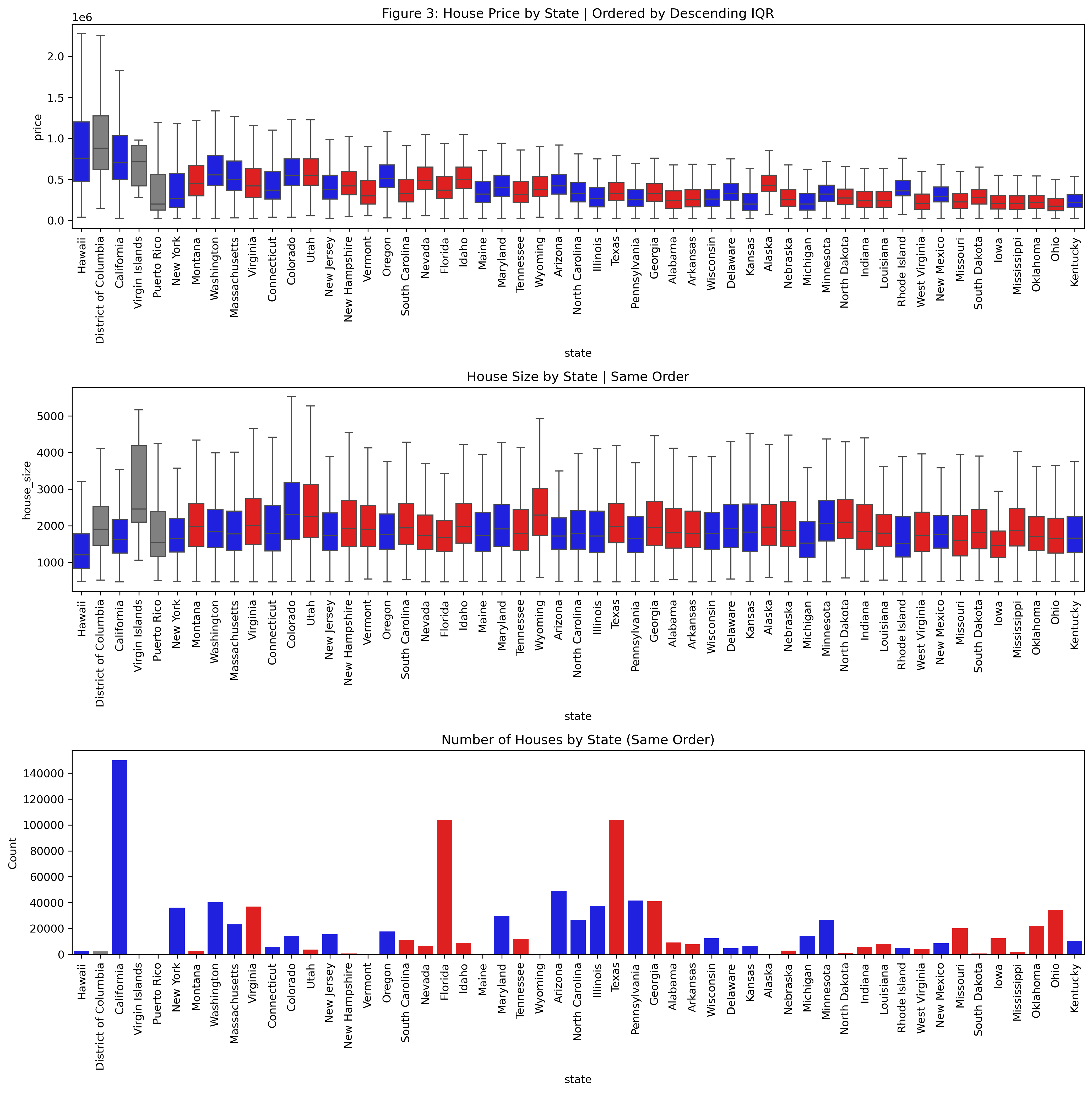
Ordered by Average IQR
Code
# Party color mapparty_colors = {"Democrat": "blue","Republican": "red","Other": "gray"}# Compute IQR for ordering q1 = df_eda.groupby("state")["price"].quantile(0.25)q3 = df_eda.groupby("state")["price"].quantile(0.75)iqr = q3 - q1state_order = iqr.sort_values(ascending=False).index# Compute countsstate_counts = df_eda.groupby("state")["price"].size().reindex(state_order)# Build per-state color mappingstate_party = ( df_eda.drop_duplicates("state") .set_index("state")["party"] .reindex(state_order))color_map =dict(zip( state_order, state_party.map(party_colors).fillna("gray") ))n=1plt.figure(figsize=(14*n, 14*n))# Priceplt.subplot(3, 1, 1)sns.boxplot( data=df_eda, x="state", y="price", order=state_order, showfliers=False, hue="state", palette=color_map, legend=False)plt.title("Figure 3: House Price by State | Ordered by Descending IQR")plt.xticks(rotation=90)# House Sizeplt.subplot(3, 1, 2)sns.boxplot( data=df_eda, x="state", y="house_size", order=state_order, showfliers=False, hue="state", palette=color_map, legend=False)plt.title("House Size by State | Same Order")plt.xticks(rotation=90)# Countsplt.subplot(3, 1, 3)sns.barplot( x=state_counts.index, y=state_counts.values, order=state_order, hue=state_counts.index, palette=color_map, legend=False)plt.title("Number of Houses by State (Same Order)")plt.ylabel("Count")plt.xticks(rotation=90)plt.tight_layout()plt.show()
Interpretation of Boxplot Graphs
The multi-panel visualizations (Figure 2 and 3) above provide a straightforward way to compare housing markets across states. The first plot ranks states by their average house price, going left to right, giving a quick snapshot of where prices tend to be higher or lower. The boxplots also show how volatile prices are within each state, which helps reveal whether a state has a wide range of housing options or a more uniform market.
The second plot uses the exact ordering as the top graph to show the distribution of house sizes. This makes it easy to see whether states with higher prices also tend to have larger homes, or whether the price differences come from other factors.
The final bar plot shows how many total listings each state has. This helps explain some of the variation seen in the price and size boxplots, since states with more listings naturally show more spread in their distributions.
With this combination of graphs, a realtor can extract several useful insights. One clear pattern is that red states tend to have lower and less volatile home prices overall. This type of information can be valuable during pricing discussions or negotiations, since it provides context about what is typical or reasonable within a given market.
If the user wants the exact numerical values behind these trends, they can refer to the summary table above. By adjusting the two arguments in the sort_values() method, they can easily sort the table by whichever metric they are interested in.
Average Price vs Bed vs Bath Heatmap
Code
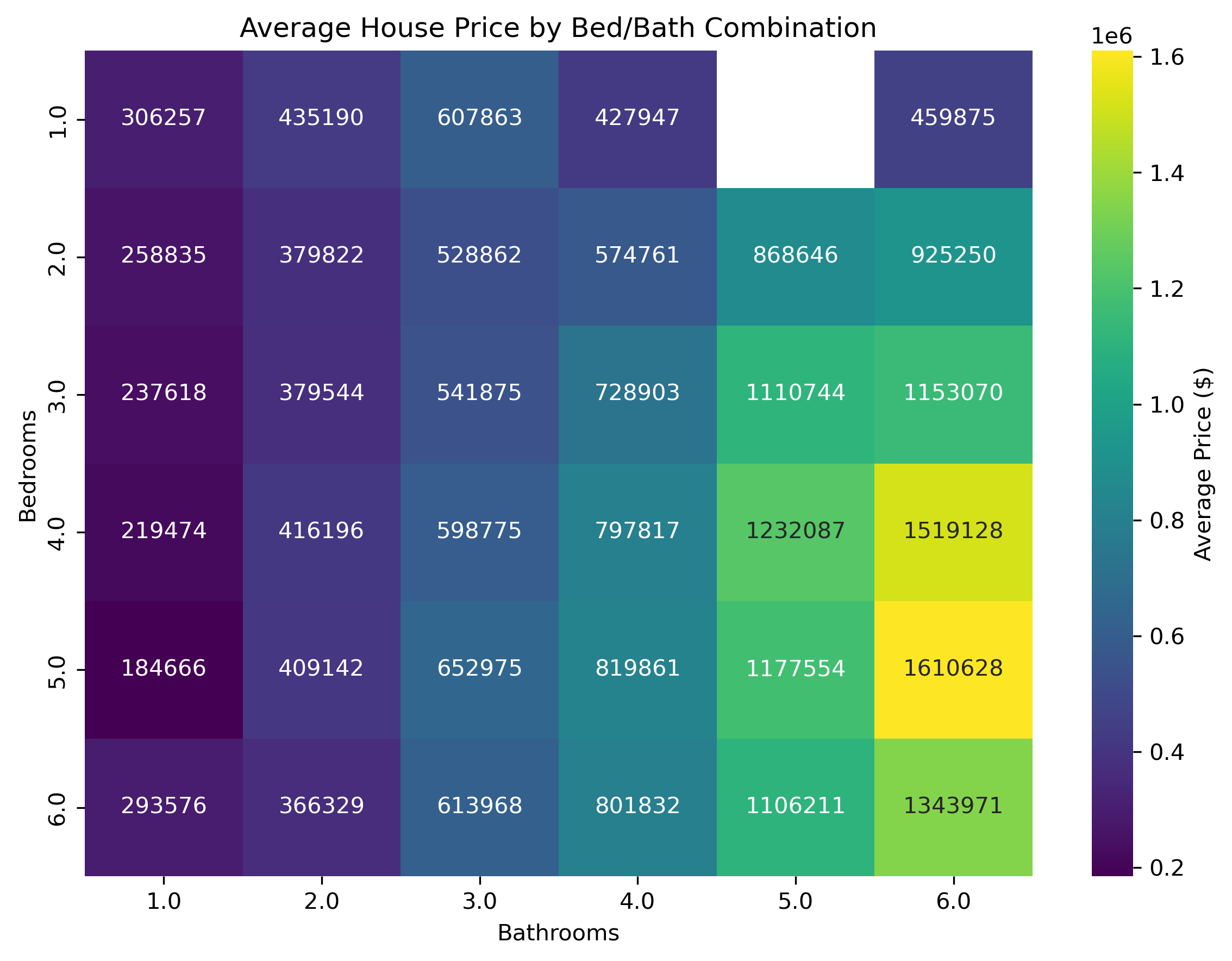
bb_stats = ( df_eda.groupby(["bed", "bath"], observed=True) .agg( mean_price=("price", "mean"), n=("price", "size") ) .reset_index())# Pivot to bed x bath grid of mean priceheat_data = bb_stats.pivot(index="bed", columns="bath", values="mean_price")# Heatmapplt.figure(figsize=(8, 6))sns.heatmap( heat_data, annot=True, fmt=".0f", cmap="viridis", cbar_kws={"label": "Average Price ($)"})plt.title("Figure 4: Average House Price by Bed/Bath Combination")plt.xlabel("Bathrooms")plt.ylabel("Bedrooms")plt.tight_layout()plt.show()
Up to this point, the analysis has examined house-size visualizations to understand general trends. Next, this analysis examines how the number of bedrooms and bathrooms relates to price. A correlation heatmap turned out to be the most effective way to do this. In the heatmap (Figure 4), we see a smooth gradient from left to right and top to bottom, confirming the expectation that increases in both bedrooms and bathrooms are associated with higher house prices.
Visualization Summary
Figure 1: Correlation Heatmap
Key Takeaway: Physical interior features (size, beds, baths) matter far more for price than exterior or location encodings in this dataset.
Figure 2: State-Level Comparison (Ordered by Mean Price)
Democrat-leaning states generally have higher average housing prices, likely because they contain more urbanized areas. This gives confidence that the dataset reflects real-world market patterns.
Despite the expectation that homes in Republican-leaning (more rural) states would be larger due to greater land availability, the filtered dataset shows little difference in house sizes between parties.
Key Takeaway: States with Democratic affiliation tend to have higher overall home prices, which may be due to greater urbanization and higher housing demand, not the party label itself.
Figure 3: State-Level Comparison (Ordered by IQR or Volatility)
Key Takeaway: Many of the least volatile housing markets are Republican-leaning states, which suggests that their economic conditions, policies, or rural structure may contribute to more stable home prices. However, these causal interpretations come from loose and shaky visual inference which means further investigation beyond this dataset is necessary.
Figure 4: Bed, Bath, Average Price Heatmap
Key Takeaway: As expected, there is a smooth monotonic gradient from left to right and top to bottom which says if you increase the bed or bathroom counts, expect the average price to increase.
Modeling
Model Sweep
Code
from sklearn.preprocessing import LabelEncoderdf_model = df3.copy()# Cast city and state as objects (for one-hot encoding later)for col in ['city', 'state']: df_model[col] = df_model[col].astype('object')# Label encode status and partyfor col in ['status', 'party']: le = LabelEncoder() df_model[col] = le.fit_transform(df_model[col].astype(str))
The goal of the model sweep was to see how well a range of common regression algorithms handled the dataset. Running every model on the full million rows would take too long, so each model was tested on a sample of 800 rows. Ridge, Random Forest, and Gradient Boosting performed the best, which pointed toward XGBoost as a strong candidate for the final model. Although Ridge slightly outperformed the tree-based models, it offers far less flexibility and tunability than XGBoost. For this project, the ability to fine-tune the model makes XGBoost the better final choice.
XGBoost
Tuning Hyperparameters
Code
# Ensure all categoricals are proper category dtype for XGBoostfor col in ["status", "party", "city", "state"]: df_model[col] = df_model[col].astype("category")
Code
n =5000df_sample = df_model.sample(n=n, random_state=42)# Features and targetX = df_sample.drop(columns=['price'])y = df_sample['price']# Train/test split (70/30)X_train, X_test, y_train, y_test = train_test_split( X, y, test_size=0.30, random_state=42)
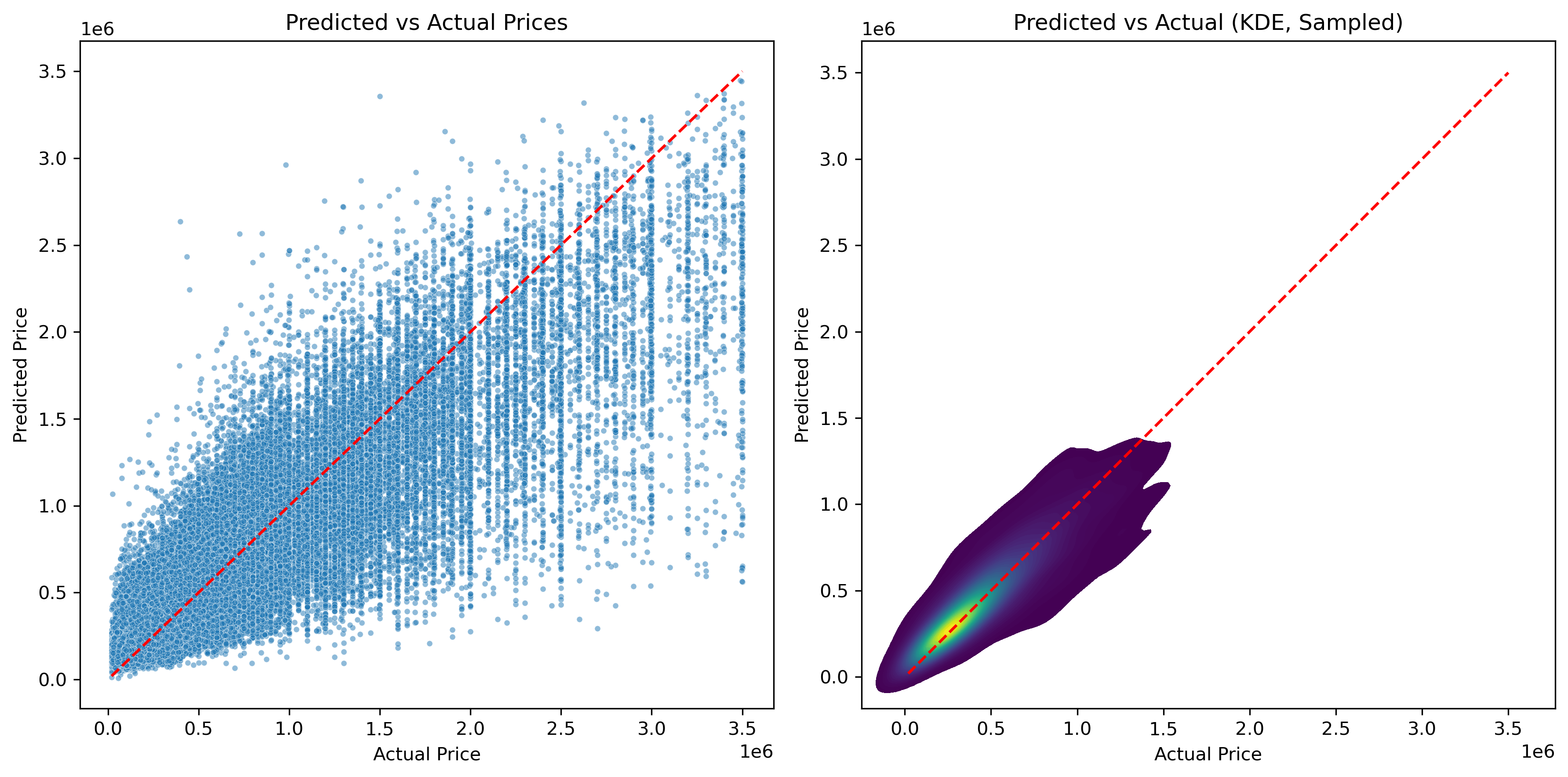
The scatterplot was expected to look somewhat scattered, but the KDE overlay shows that the datapoints generally follow the ideal line. This suggests that the predictions stay close to the actual values, which is a strong indication that the model is performing well.
Feature Importance
Code
booster = best_model.get_booster()# XGBoost importance by "gain" raw_importance = booster.get_score(importance_type="gain")feature_map = {f"f{i}": col for i, col inenumerate(X_train.columns)}importance_items = []for fname, score in raw_importance.items(): nice_name = feature_map.get(fname, fname) importance_items.append((nice_name, score))fi_df = ( pd.DataFrame(importance_items, columns=["feature", "gain_importance"]) .sort_values("gain_importance", ascending=False) .reset_index(drop=True))
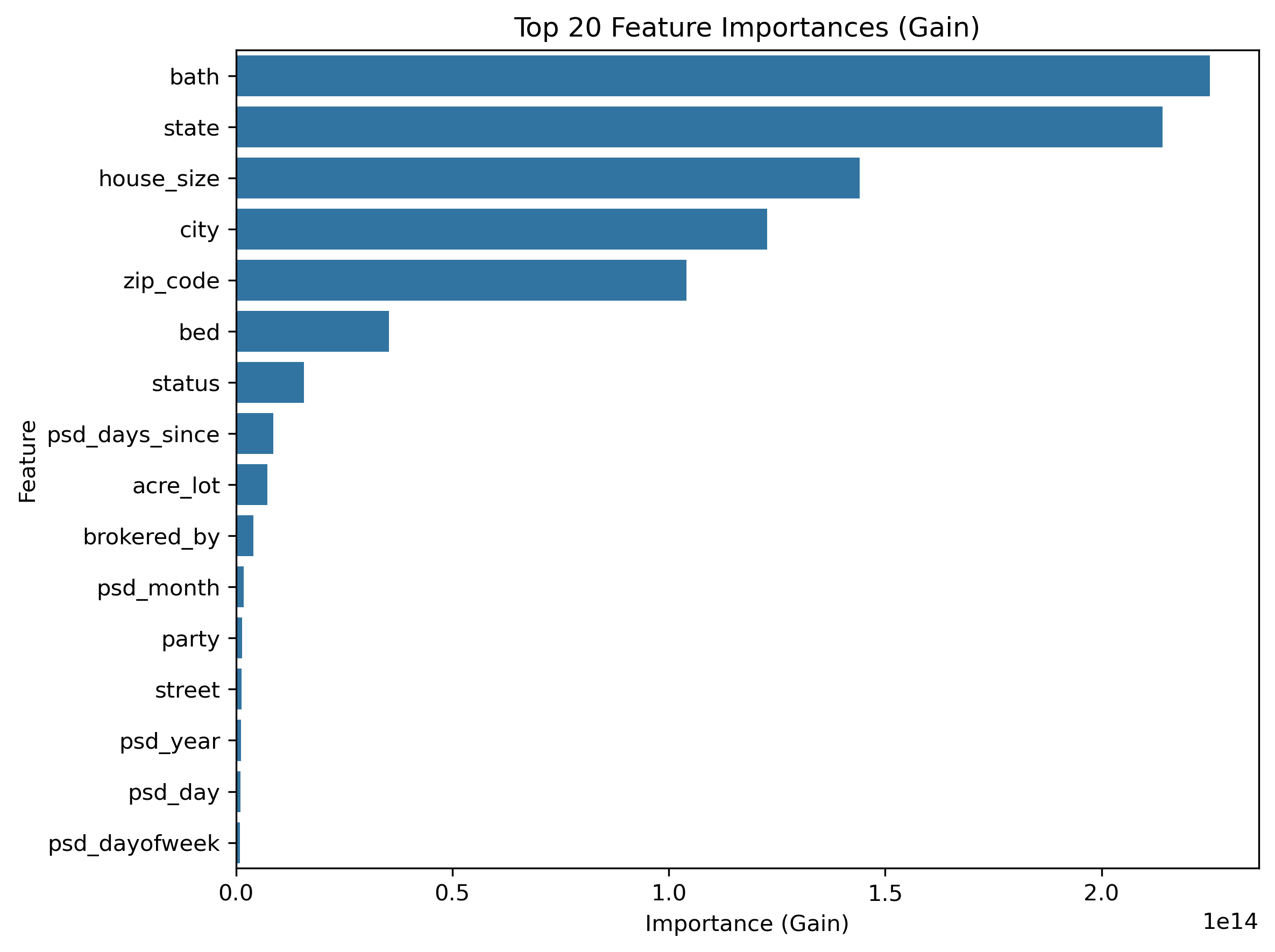
The trends observed in the EDA are reflected in XGBoost’s feature importance rankings. As expected, the number of bathrooms and house size play dominant roles in predicting price. What is more surprising is that the number of bedrooms is less influential than city, zip code, and even party. State, city, and zip code naturally share some collinearity, but each captures different patterns in the housing market, so removing them would result in a loss of meaningful information. Overall, the feature importance results mostly match the insights from the EDA, which gives a realtor confidence that the model’s focus aligns with real-world intuition.
Error By Groups (State & Price)
Code
results = pd.DataFrame({"actual": y_test,"predicted": y_test_pred,})results["residual"] = results["actual"] - results["predicted"]# Merge back with the original test features to include group columnsresults = pd.concat([results, X_test.reset_index(drop=True)], axis=1)
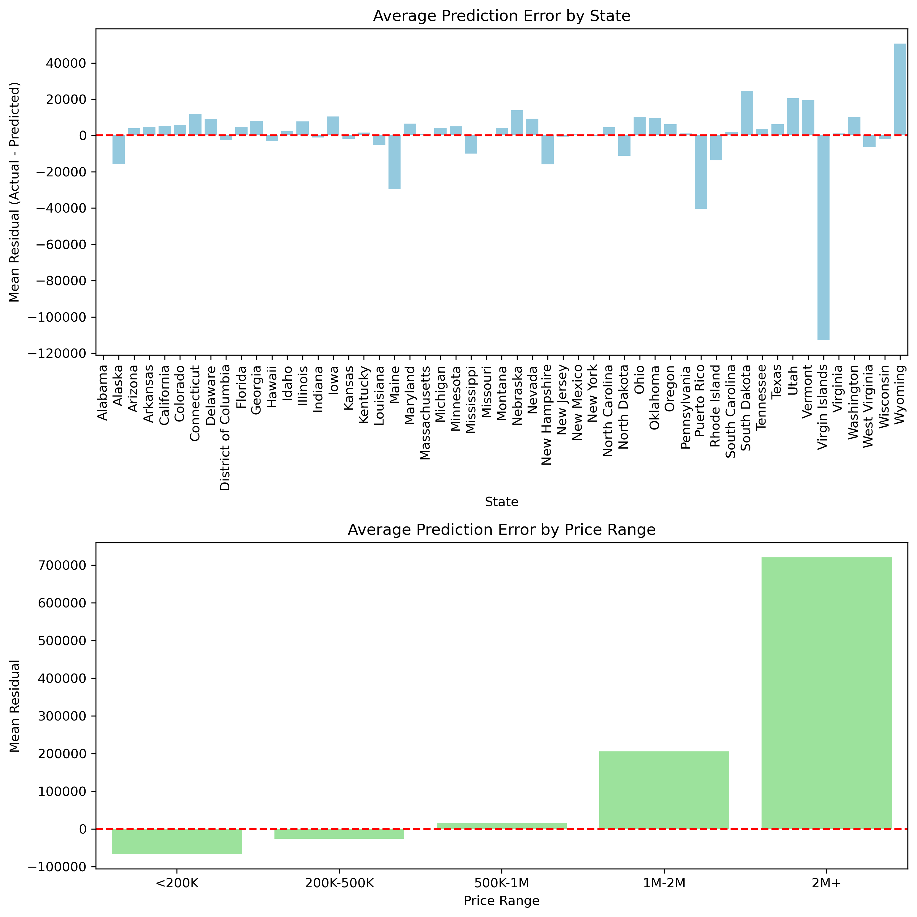
To understand how the model behaves across different segments of the data, I examined grouped residuals. Looking at residuals by state highlights which regions tend to be consistently overpredicted or underpredicted, which is useful for fine-tuning price estimates in specific markets. Grouping errors by price brackets provides additional insight. The model performs most accurately on mid-range homes, while high-end properties show noticeably larger errors. This pattern is consistent with those observed in the EDA, especially in the boxplots, where states with the least volatility in their IQR also tended to have the smallest residuals. Once again, the model reinforces earlier findings, strengthening confidence that the relationships seen in the EDA carry through into the final predictions.
Conclusion
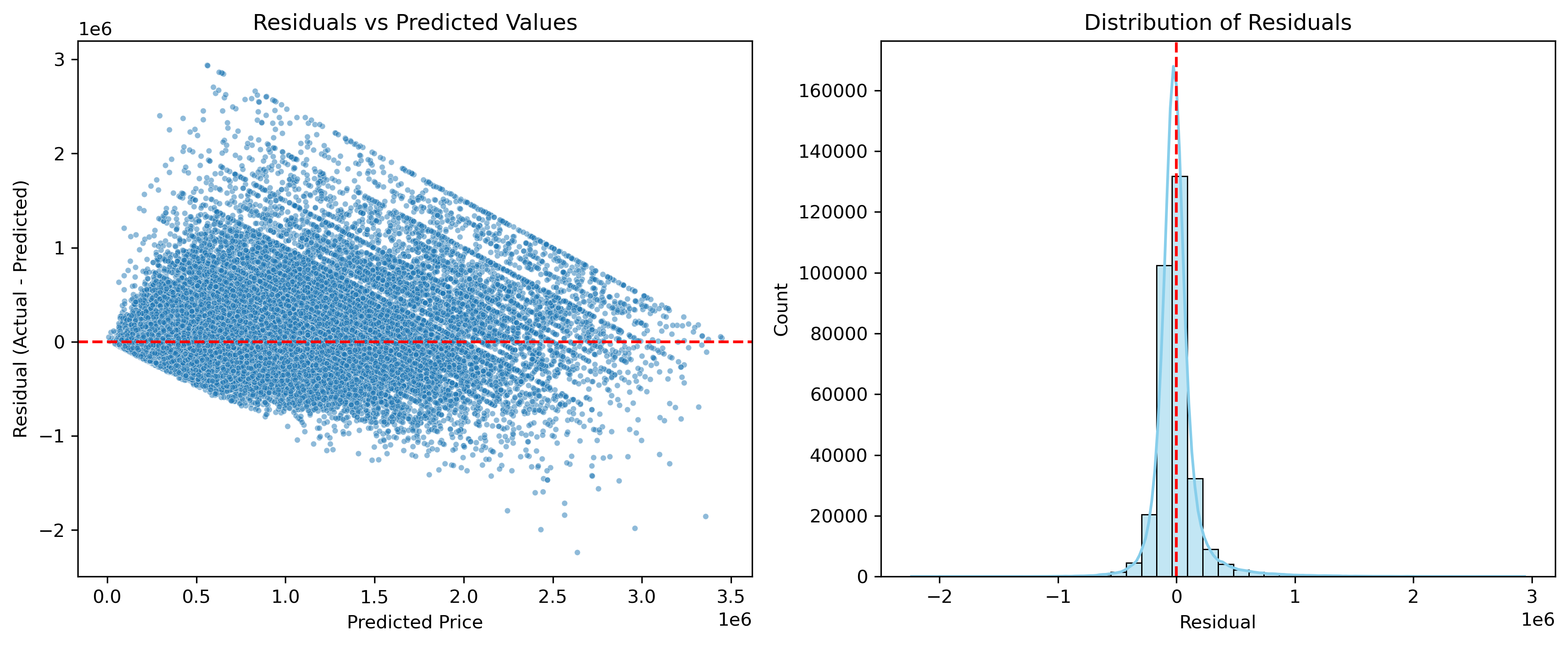
The XGBoost model performed well and achieved a “test set” \(R^2\) of about 0.79. This indicates that the model captured most of the variation in housing prices even though the market is complex. The training \(R^2\) (0.81) and test (0.79) results are very similar, which suggests that the model is not overfitting.
The residual analysis shows that most errors are small and centered around zero. The largest errors appear in high-end homes and a few states. These patterns match the patterns observed in the EDA where differences in volatility and IQR already hinted at uneven behavior across markets. The agreement between the EDA and the model increases confidence that the model is learning real trends rather than noise.
Overall, this project produced a model that is both accurate and practical. A realtor can use it to generate a data-informed starting price for a new property, then refine that estimate further based on local knowledge and factors that the dataset cannot capture.