Bayesian Kinetics: Fitting Caspase-3 Progress Curves with PyMC
1 TL;DR
Model 5
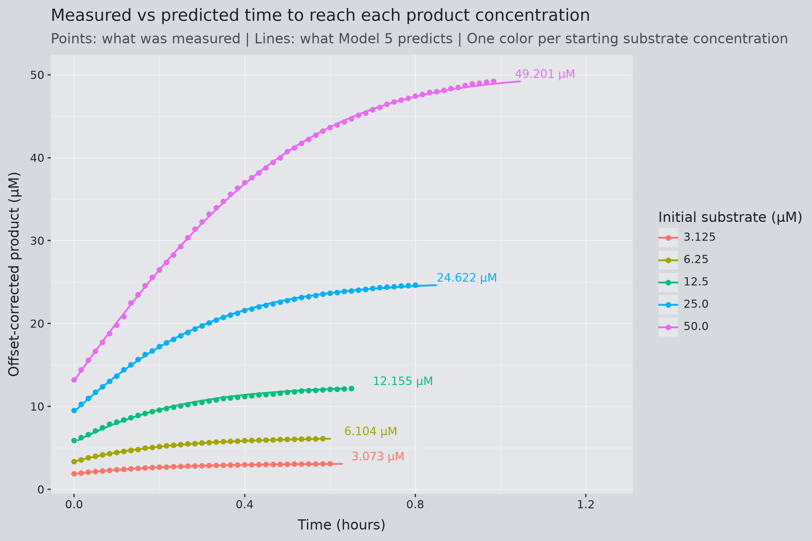
I used a published dataset tracking how fast an enzyme (caspase-3) converts its substrate into product at five different starting substrate amounts. I fitted the standard textbook equation for enzyme speed (Michaelis–Menten) to the dataset using Bayesian statistics, so each fitted parameter comes out as a list of numbers with an attached probability, rather than a single calculated number.
- I fit six PyMC models of increasing complexity, with each change incrementally fixing issues in the previous model.
- The best model (Model 5) gives \(V_{\max} = 118.9 \pm 1.3\) µM/hour and \(K_m = 23.1 \pm 0.4\) µM, within about 9% of the article’s own values.
- Inverting the fit to predict “how long until the product reaches concentration X” reaches an \(R^2\) of 0.996 for the final use case.
- Nothing here is specific to enzymes. The same workflow (write down the model, give its parameter priors, sample, check the fit) applies to any field with a trusted model and noisy data: pharmacokinetics, epidemiology, process engineering, economics, ecology.
2 Project Overview
2.1 Summary
I use Bayesian inference to estimate Michaelis–Menten parameters from caspase-3 assay data, then use the integrated equation to predict the time required to reach a target product concentration.
2.2 Motivation and Background
After graduating from NJIT with a bachelor’s in chemical engineering and a master’s in data science, I wanted to create a project that used both. After some thought, kinetics seemed like the best subject to combine skills for both degrees.
While reviewing kinetics, I realized that mathematical models can also be viewed as causal relationships (to a degree). As loose as that logic is, it reminded me of a topic I had been neglecting, Bayesian statistics. I first discovered this subject in 2021 through Richard McElreath’s book Statistical Rethinking, but I couldn’t learn it alongside my classes because I couldn’t manage both at once.
Now seems like a perfect time to learn through application.
2.3 Research Questions and Objectives
- What are the Michaelis–Menten parameters, and how uncertain are their estimates?
- Can those parameters predict the time to reach a specified product concentration, \(t(C_B)\)?
3 Bayesian Statistics Concepts
3.1 Quick Overview
Directed Acyclic Graphs(DAGs) show how variables depend on one another in a model. In the PyMC-generated graphs, an arrow means that one variable is used to calculate or define another. These graphs make the model’s structure easier to follow, but they do not, by themselves, prove causality.- DAGs are also used in other contexts, where arrows may represent different types of relationships, so their meaning depends on how the graph is defined.
Priorsdescribe what parameter values are plausible before fitting the data. They are effectively informed guesses. For example, before measuring a plant, we might expect its height to be around 30 cm, with shorter or taller heights considered possible but less likely.Posteriorsdescribe what parameter values are plausible after combining the priors with the observed data through the likelihood. They are updated estimates that include uncertainty.Likelihooddescribes how well different parameter values explain the observed data under the model. In this project, it measures how well the concentrations predicted by the Michaelis–Menten equation (the model’s backbone) agree with the measurements, given the assumed measurement noise.
The collapsible section below, “Similarities with linear regression,” provides additional explanation.
4 The Article
4.1 Brief Overview
The paper presents a modified linearized representation that makes unexpected behavior in enzyme kinetics easier to detect. Its experiments and simulations show why apparently good fits may not be sufficient quality checks.
For this project, I use the same starting point, the Michaelis–Menten equation, and data from one of their experiments, but take the analysis in a different direction to answer my own project objectives.
4.2 The Caspase-3 Assay
This Bayesian analysis uses the purified caspase-3 assay, where Ac-DEVD-AMC is cleaved to release fluorescent AMC. Product concentration was tracked at \(37^\circ\mathrm{C}\) using 1.0 U of enzyme and five initial substrate concentrations ranging from 3.125 to 50 \(\mu\mathrm{M}\). The authors identified the first ten minutes as a stabilization period to exclude from kinetic analysis.
I modeled the assay as a well-mixed batch reaction at constant temperature and volume, using the simplified conversion \(A\rightarrow B\) to track substrate consumption and AMC formation.
5 From Chemical Equation to Kinetics Differential Equation
5.1 Chemical Equation and Terms
The simplified equation is as follows:
\[ aA \rightarrow bB \]
- \(a\) and \(b\) both equal 1, but I present them in the equation above for clarity later in the derivation.
- \(C_{A0}\) is the concentration of the initial substrate (Ac-DEVD-AMC)
- \(C_{B0}\) is the concentration of the initial product present (AMC)
- \(C_B\) is the concentration of the product at any time (AMC)
5.2 Michaelis–Menten Kinetics
\[ -r_A=\frac{V_{\max}C_A}{K_m+C_A} \]
The article chooses to use the integrated form of the Michaelis-Menten equation as the basis for its kinetic analysis. After reading about the reaction’s characteristics, I also think the Michaelis-Menten relationship is an appropriate basis for Bayesian models in PyMC. But for my Bayesian models, I use the differential form of the kinetic equation. I derive it from the mole balance to make the underlying assumptions explicit, then integrate it to check that it agrees with the equation used in the article.
\[ \begin{alignedat}{2} \frac{dC_B}{dt} &= \frac{V_{\max}(C_{A0}-C_B)} {K_m+C_{A0}-C_B} &&\quad (\text{Differential equation used in the Bayesian models}) \\[12pt] t &= \frac{ (C_B-C_{B0}) -K_m\ln\left(\frac{C_{A0}-C_B}{C_{A0}-C_{B0}}\right) }{V_{\max}} &&\quad (\text{Equation used to predict time}) \\[12pt] P &= V_{\max}t+K_m\ln\left(1-\frac{P}{S_0}\right) &&\quad (\text{Agreement with the article when } C_{B0}=0) \end{alignedat} \]
These three equations serve different purposes.
The first equation lets PyMC calculate product concentrations over time and use the measurements to estimate the kinetic parameters.
The second uses those estimates to calculate the time to reach a chosen product concentration, \(C_B\).
I derived the third only to check that I reached the same equation as the authors. I do not use it elsewhere in the project.
6 Understanding the Model Structure
6.1 Model 1 Structure
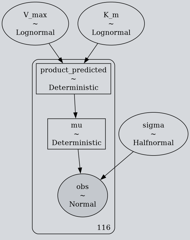
I built six models, starting with Model 1, which uses the simplest assumptions. It includes the full time series, sets the initial product concentration to zero, and assumes no measurement offset.
| Step | Bayesian linear regression | Model 1 |
|---|---|---|
| Unknowns: \(\theta\) | \(m,\ b,\ \sigma\) | \(V_{\max},\ K_m,\ \sigma\) |
| Priors: \(p(\theta)\) | \(m\sim\operatorname{Normal}(0,s_m)\), \(b\sim\operatorname{Normal}(0,s_b)\), \(\sigma\sim\operatorname{HalfNormal}(s_\sigma)\) | \(V_{\max},K_m\sim\operatorname{LogNormal}(0,1)\), \(\sigma\sim\operatorname{HalfNormal}(1)\) |
| Expected response | \(\mu_i=mx_i+b\) | \(\mu_i=C_B(t_i)\), from the rate equation with \(C_{B0}=0\) |
| Likelihood, per observation | \(y_i\sim\operatorname{Normal}(\mu_i,\sigma)\) | \(y_i\sim\operatorname{Normal}(\mu_i,\sigma)\) |
I fixed \(C_{B0}=0\) and \(C_{A0}=3.125\), so the model assumes no product is present initially and cannot adjust that value during fitting. Parameters with prior distributions, such as \(V_{\max}\) and \(K_m\), are instead estimated from the data.
6.2 Model 1 Tables
Sampling diagnostics: These check whether the sampler explored the posterior properly before you trust the estimates.
- ESS (effective sample size). MCMC draws are taken in sequence, so each one overlaps with its neighbors and repeats some of what they already said. ESS is computed after sampling and reports how many independent draws would carry the same information as the whole correlated set. For Model 1, the 4,000 draws carry as much information as about 1,200 independent draws would for \(V_{\max}\). Higher is better. With four chains, at least 400 is the minimum for stable means and interval endpoints.
- Bulk ESS is the effective sample size for the main body of the posterior, which determines how well the mean and median are estimated.
- Tail ESS is the effective sample size for the 2.5% and 97.5% quantiles, which determines how well the interval endpoints are estimated.
- \(\hat R\) compares the spread within each chain to the spread between chains. Values near 1.00 mean all chains found the same posterior, and anything above 1.01 is a warning.
- Divergences count the times the sampler failed to track the posterior and should be zero.
Model 1 interpretation: ESS is 900 to 1500 for every parameter, \(\hat R\) is 1.001, and there are no divergences, so the sampler worked and the estimates below can be read at face value.
Parameter estimates: Each row summarizes the posterior for one parameter.
- Mean and standard deviation (SD) are the center and spread of the posterior draws.
- Relative SD is the SD as a percentage of the mean, making uncertainty comparable across parameters with different units.
- The 95% columns are credible intervals: the range containing the middle 95% of the posterior draws, so there is a 95% probability the parameter lies within it, given the model, priors, and data.
- I compute the ratio \(V_{\max}/K_m\) from the same draws, so it has its own posterior.
Model 1 interpretation: The two kinetic parameters mean different things:
- \(V_{\max}\) is the reaction’s top speed, reached when substrate is plentiful and every enzyme molecule is busy.
- \(K_m\) is the substrate concentration at which the rate is half of \(V_{\max}\). It marks where “low” substrate ends and “high” substrate begins.
Both are poorly determined here. Relative SD is 34% and 37%, and the 95% intervals are wide: \(V_{\max}\) could be anywhere from 49 to 169 µM/hour and \(K_m\) from 10 to 37 µM. Their ratio is known to within 4%. I believe this is due to the model structure, not the sampler. Models 1-4 use only \(C_{A0}=3.125\) µM, so the substrate never gets near \(K_m\), and the rate is roughly \((V_{\max}/K_m) C_A\) throughout; the curve reveals only the ratio, not the two parameters separately.
Fit: \(R^2\) compares the squared error of the fitted curve to the squared spread of the data around their own mean:
\[ R^2 = 1 - \frac{\sum_i (y_i - \hat y_i)^2}{\sum_i (y_i - \bar y)^2} \]
I am assuming that the article’s fits were done with MATLAB’s fit and fitlm functions, so I used the same definition as the MATLAB Curve Fitting Toolbox (Evaluating Goodness of Fit), with the posterior mean of \(\mu\) as the fitted curve. A value of 1 means the curve passes through every point, and 0 means it does no better than a flat line at the mean. For models 1-4, there is only one concentration, so the table has one row.
Model 1 interpretation: This \(R^2\) is computed from:
- \(y_i\): the 115 measured product concentrations in the 3.125 µM curve, including the first ten minutes (Model 1 keeps the full series)
- \(\hat y_i\): the posterior mean of \(\mu\) at each measured time, which is the dark blue line in the posterior predictive plot
- \(\bar y\): the mean of the 115 measurements
\(R^2=0.964\) sounds high, but for a simple, predictable curve it is not that impressive, and concentration \(R^2\) is a weak measure anyway. Model 5 reaches 0.999948, yet when its parameters are used in the integrated equation to predict time, the \(R^2\) drops to 0.28 overall and to 0.18 for the \(C_{A0}=3.125\) µM curve, before any adjustments. If an almost perfect concentration fit yields poor time predictions, 0.964 is somewhat concerning.
6.3 Model 1 Plots
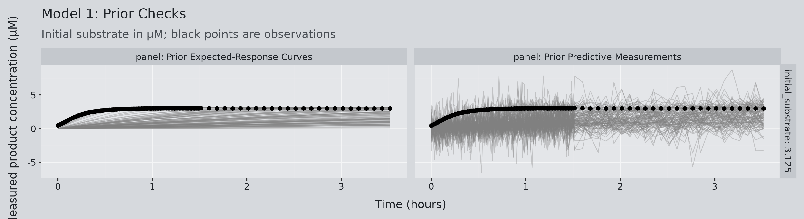
Prior predictive check: Before fitting, I checked what the priors allow. Each gray line is one curve the model considers plausible, so the observations should fall within the range the lines cover.
Model 1 interpretation: The guesses were too slow and too low. \(V_{\max}\sim\operatorname{LogNormal}(0,1)\) has a median of \(e^0=1\) µM/hour, two orders of magnitude below the article’s \(V=109\) µM/hour, so the curves climb much too slowly. With \(C_{B0}\) fixed and no offset \(b\), they all start at zero. The right panel only covers the points because \(\sigma\) allows a lot of noise. Even so, the data still mostly pulled the model toward the right answer.
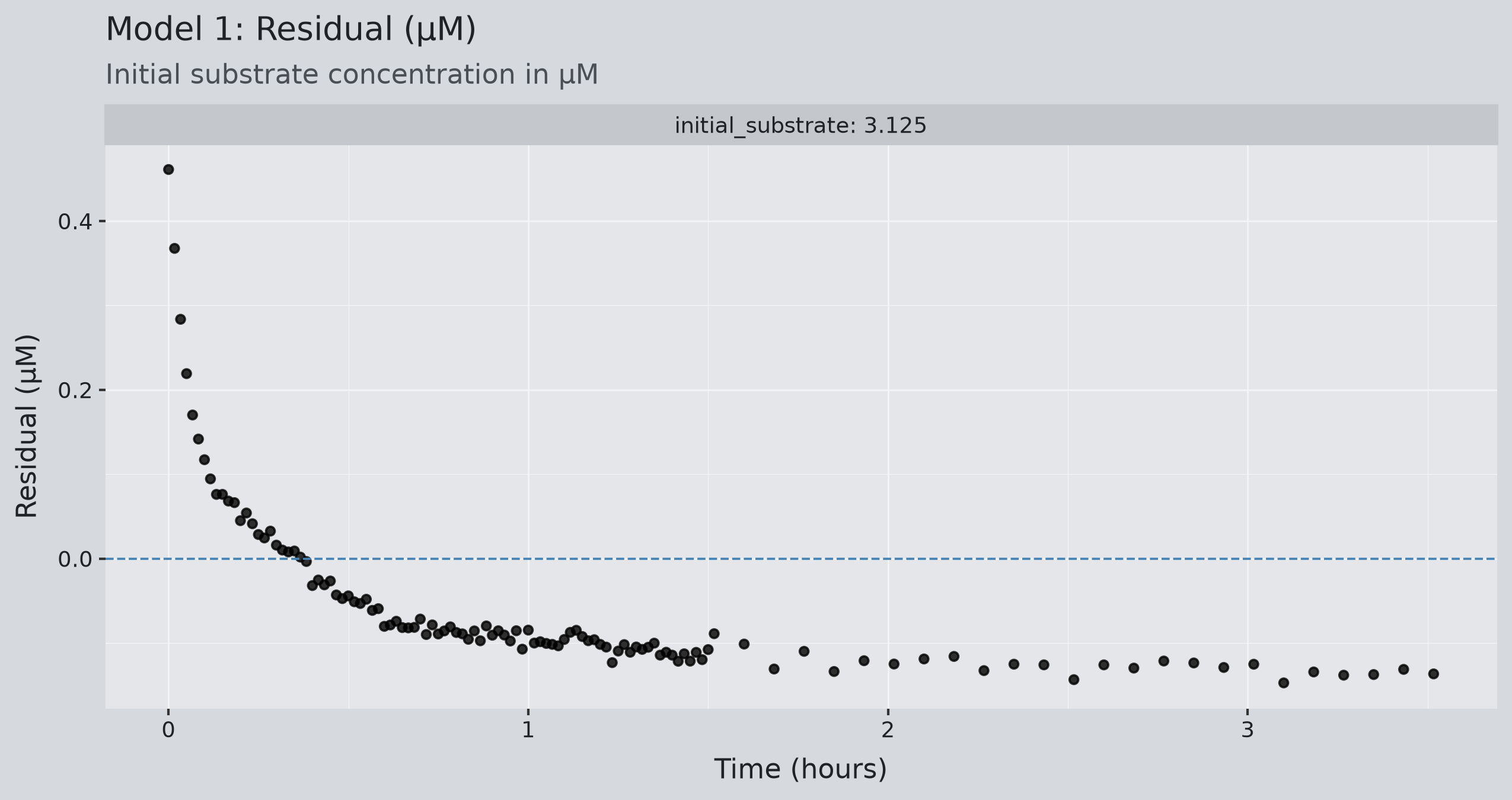
Residuals: Residuals are the observed values minus the fitted curve. In linear regression, you should see a random scatter around zero. A pattern here suggests the model’s assumptions are missing something.
Model 1 interpretation: The residuals are not random, and the plot points to two causes. The first readings sit well above zero because the model is forced to start at \(C_{B0}=0\) while the first measurement is already about 0.45 µM. The plateau sits about 0.12 µM below zero because the model must level off at exactly \(C_{A0}=3.125\) µM while the data level off near 3.0 µM. Models 2–4 address these by dropping the first ten minutes, estimating \(C_{B0}\), and adding an offset \(b\).
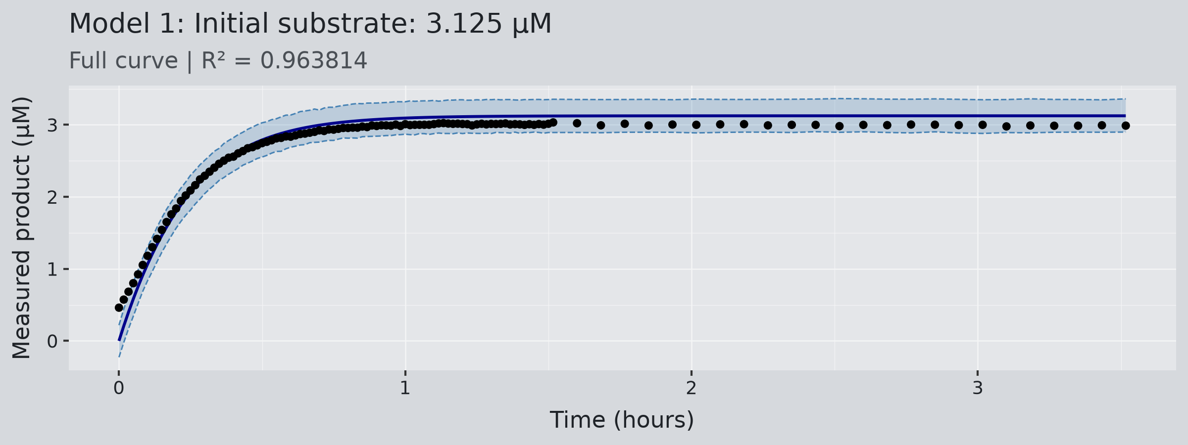
Posterior predictive check: After fitting, the plot shows:
- The dark line is the posterior mean of \(\mu_i\)
- The blue band is the 95% credible interval of \(y_i\sim\operatorname{Normal}(\mu_i,\sigma)\), the likelihood from the earlier table, evaluated over all posterior draws of \(V_{\max}\), \(K_m\), and \(\sigma\). It is where the model expects new measurements to fall, so it is wider than the uncertainty in \(\mu_i\) alone.
- The subtitle reports \(R^2\)
(Again, 95% is a preference. Any other level would be just as valid.)
Model 1 interpretation: The band covers every observation, but only because it is wide. \(\sigma\) came out at 0.117 µM, roughly ten times what Model 4 finds on the same curve, so the model absorbed its misfit into the noise instead of the curve. \(R^2=0.964\) is the lowest of the six models.
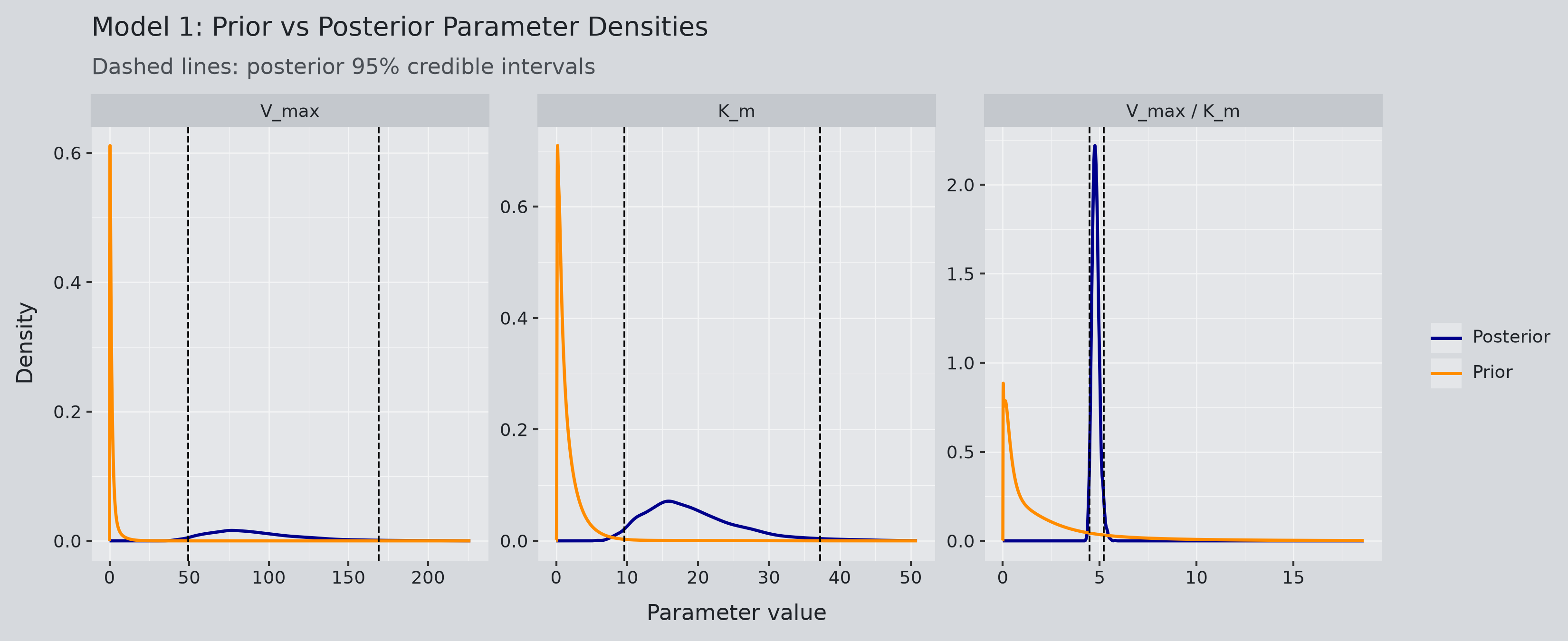
Parameter distributions: Each panel overlays the prior (orange) and the posterior (blue) for one parameter, with dashed lines at the posterior’s 95% interval. Three things to look for:
- How much narrower the posterior is than the prior, which shows how much the data taught the model
- Where the posterior sits relative to the prior, which shows whether the prior was centered in the right place
- How many peaks the posterior has, since more than one means the data support several different answers
Model 1 interpretation: To start, all three posteriors have one peak. And the posteriors for \(V_{\max}\) and \(K_m\) are much narrower than their priors but still wide, and both sit far to the right of the prior peak. The ratio \(V_{\max}/K_m\) is sharp and narrow, which is the only quantity this model pins down.
6.4 Differences in the models
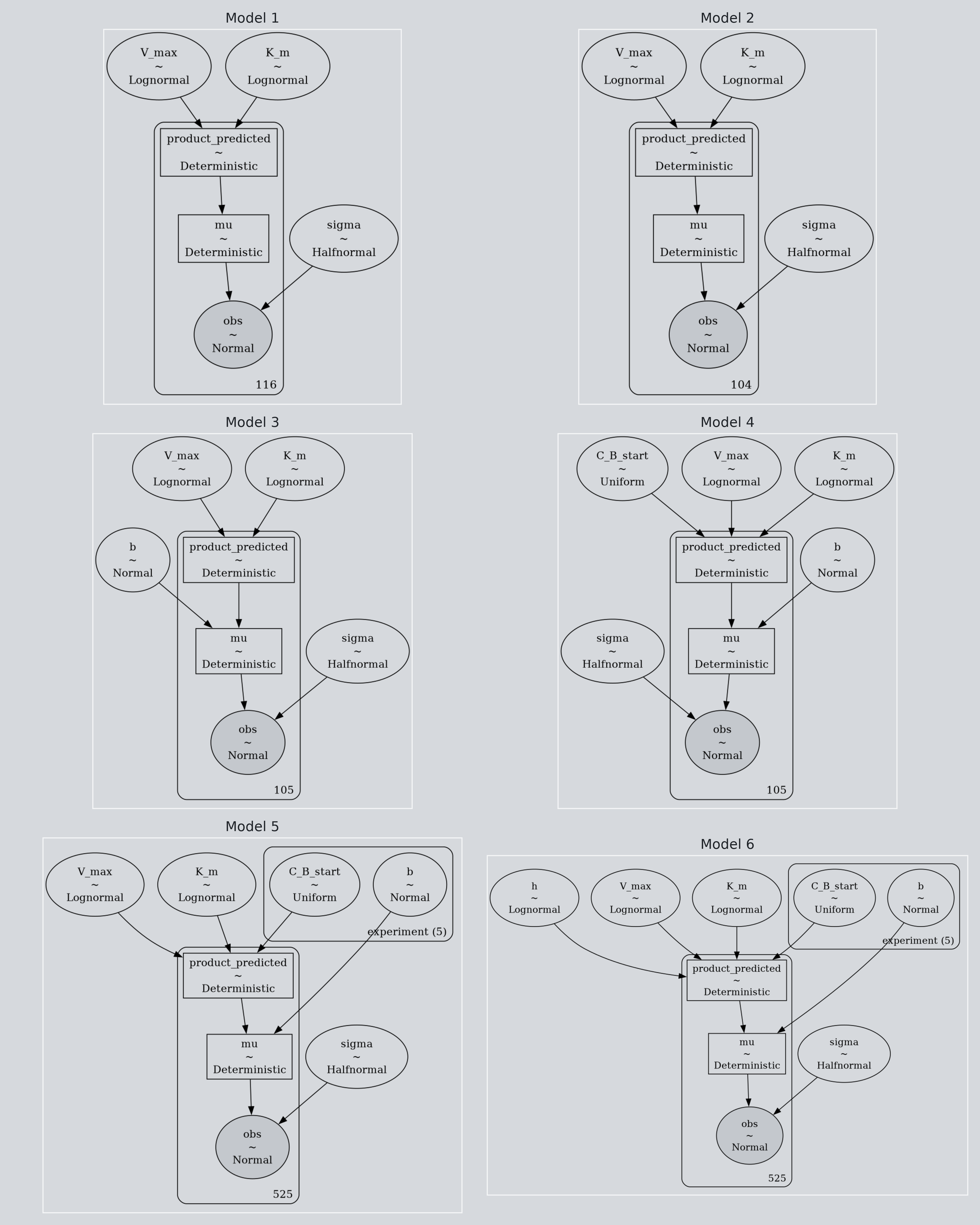
Model 1 is the baseline. Its assumptions are:
- One experiment, \(C_{A0}=3.125\) µM, fixed
- Full time series, including the first ten minutes
- Michaelis–Menten rate law
- \(C_{B0}=0\), fixed
- No measurement offset
- Priors: \(V_{\max},K_m\sim\operatorname{LogNormal}(0,1)\), \(\sigma\sim\operatorname{HalfNormal}(1)\)
- Likelihood: \(y_i\sim\operatorname{Normal}(\mu_i,\sigma)\)
Each later model changes the previous one as follows. Anything not listed is unchanged.
| Model | Change from the previous model | Reason |
|---|---|---|
| 2 |
|
|
| 3 |
|
|
| 4 |
|
|
| 5 |
|
|
| 6 |
|
|
7 Model 5: Fitting All Concentrations Together
7.1 Model 5 Tables
Model 5 interpretation: Every ESS is above 1,400, every \(\hat R\) is 1.003 or below, and there are no divergences. The sampler handled the thirteen-parameter joint model without difficulty.
Model 5 interpretation:
- Fitting the five curves together separates \(V_{\max}\) and \(K_m\). Their relative SD drops from 34% and 37% in Model 1 to 1.1% and 1.8%, and the intervals are now a few µM wide instead of tens.
- The values are close to the article’s \(V=109\) µM/hour and \(K_m=21.5\) µM, within 9% and 7%, though neither article value falls inside the 95% interval.
- The per-experiment offsets \(b\) range from -0.1 to 2.7 µM, so sharing one would not have worked. \(\sigma\) stays at 0.118 µM because the high-concentration curves have more scatter in absolute terms.
Model 5 interpretation: The overall \(R^2\) is higher than any single curve’s because each \(C_{A0}\)’s \(R^2\) is judged against that group’s own small spread, which magnifies its error. In contrast, the aggregated \(R^2\) is judged against the full 2-50 µM range. The per-curve values are the honest ones, and all five are above 0.994. The 12.5 µM curve fits least well.
7.2 Model 5 Plots
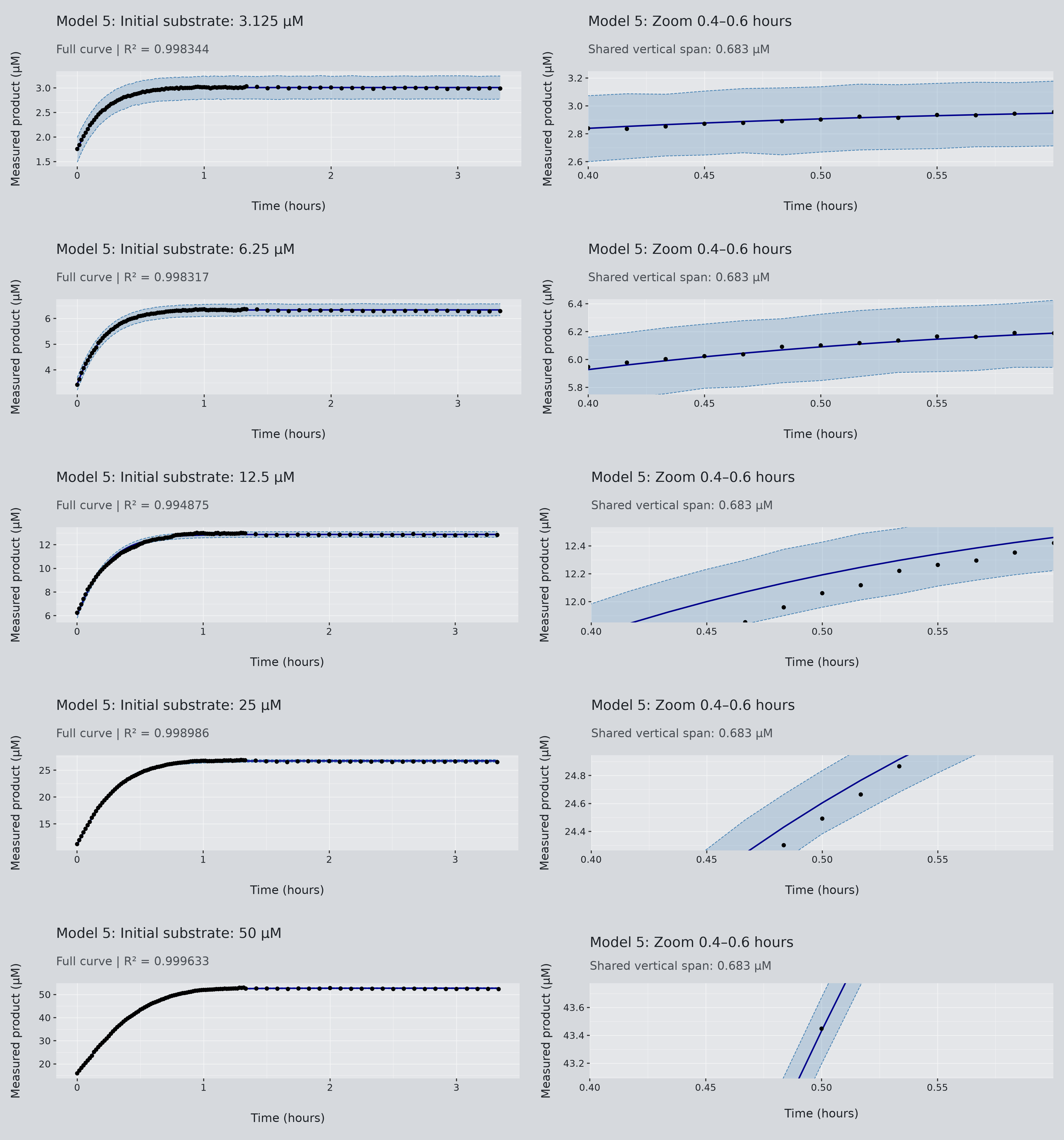
Posterior predictive check: Same plot as Model 1, one row per experiment. The right panel of each row zooms into 0.4 to 0.6 hours. The vertical span of the zoom is set by the 3.125 µM curve and reused for all five, so you can compare bandwidth across concentrations at the same scale.
Model 5 interpretation: The band has roughly the same width for every curve because all five share the same \(\sigma\) of 0.118 µM. That width is a large fraction of the 3.125 µM curve and a negligible fraction of the 50 µM curve, so the zoom uses a common vertical span.
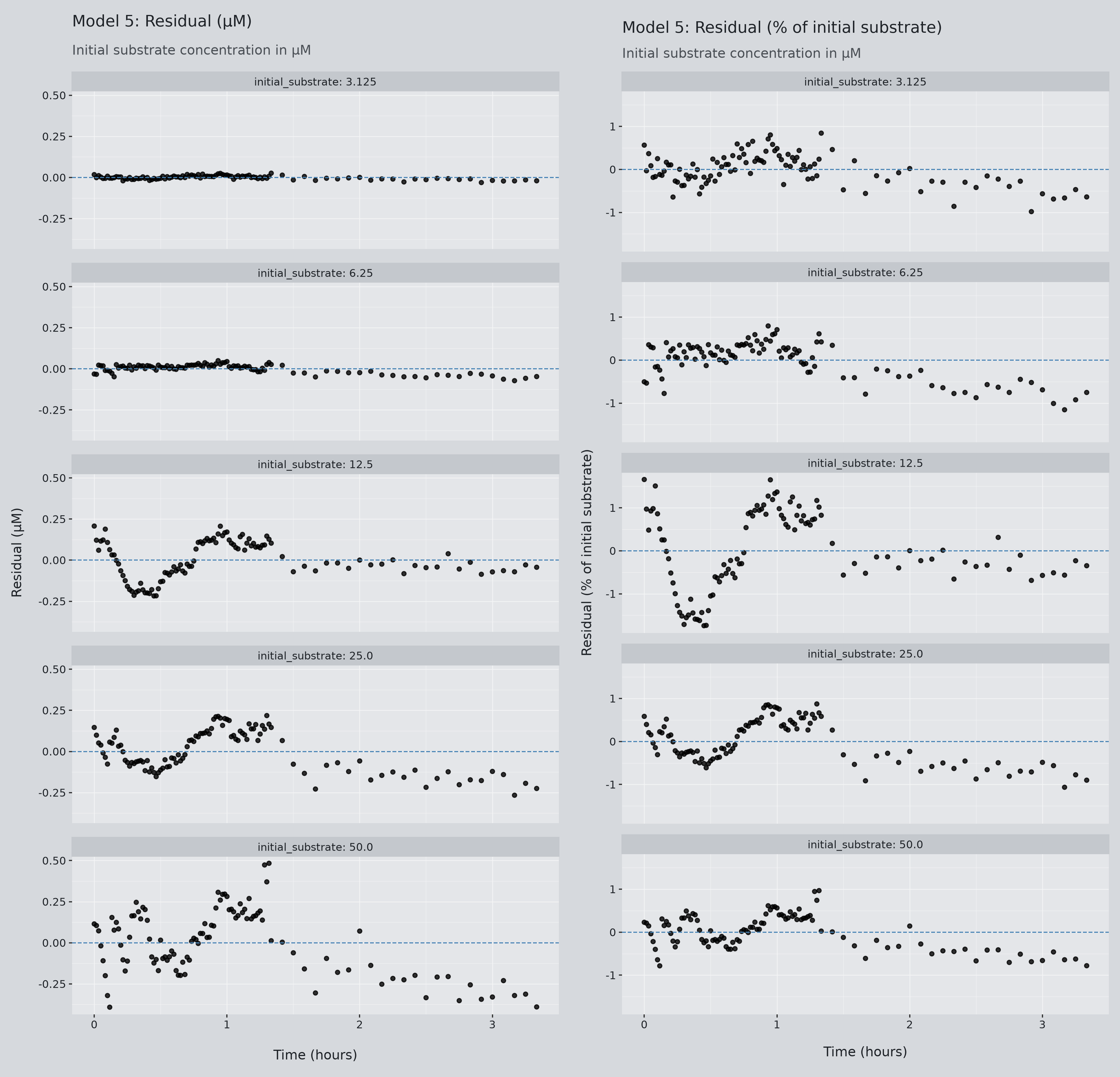
Residual plot: Measured minus predicted product at every time point, one row per experiment. The left column is in µM on a shared scale. The right column divides each residual by that experiment’s initial substrate, so the five curves can be judged on equal footing.
Model 5 interpretation:
- In µM, the low curves look clean and the high ones noisy, so the noise grows with concentration. The model assumes one fixed \(\sigma\) for all five, which is slightly off. The scaled column corrects for this, and there all five look alike.
- Subtle waves remain, most visibly in the middle concentration, where the model runs slightly high early and slightly low later. A wave like that means the curve bends a little differently from what Michaelis–Menten predicts, which is the mismatch Model 6 is meant to test.
- All five curves drift slightly below zero at late times, when measurements are farther apart, and the reaction nears its plateau. The model predicts a bit more product than was measured at the end.
- Compared with Model 1, which left a clear pattern on its single curve, these residuals sit much closer to noise around zero.
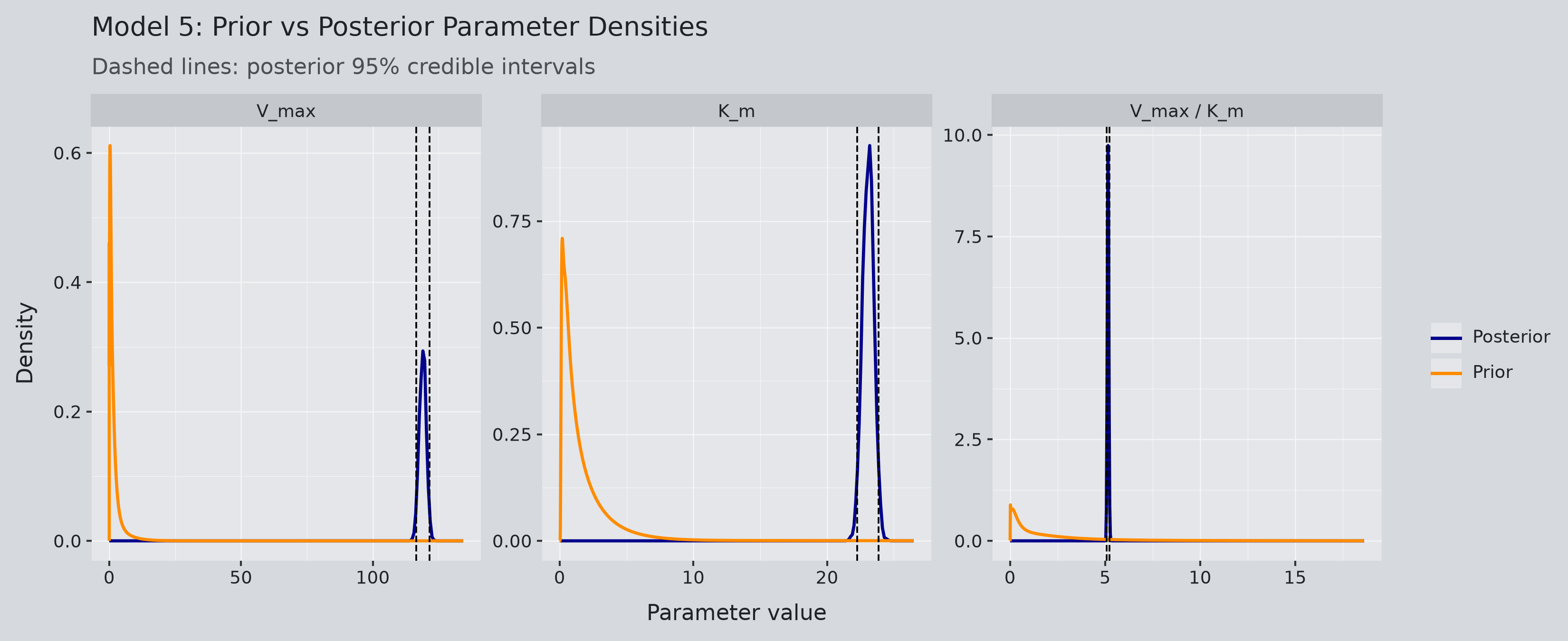
Model 5 interpretation: All three posteriors are single narrow peaks far to the right of the priors. Unlike Model 1, \(V_{\max}\) and \(K_m\) are now each as sharp as their ratio.
8 Model 6: Generalizing to the Hill Equation
Model 6 introduces the Hill exponent \(h\):
\[ \frac{dC_B}{dt} = \frac{V_{\max}C_A^h}{K_{0.5}^h+C_A^h} \]
When \(h=1\), this reduces to Michaelis–Menten kinetics. Varying \(h\) changes the shape of the rate response to substrate concentration.
For convenience and consistency, I kept the name \(K_m\) in the code and the tables, but in the Hill equation this constant is called \(K_{0.5}\). Both are the substrate concentration at half the limiting rate. The difference is in how to interpret them physically. \(K_m\) comes from a specific mechanism, while \(K_{0.5}\) does not, but this distinction doesn’t affect the Bayesian analysis.
I assigned \(h\) a lognormal prior with a median of one, so the model starts from Michaelis–Menten and lets the data move away from it, as \(V_{\max}\) and \(K_m\) are estimated rather than fixed.
8.1 Model 6 Tables
Model 6 interpretation: This run does not pass. The three kinetic parameters have ESS near 140 (well under 400), and \(\hat R\) is between 1.03 and 1.06 for several parameters, above the 1.01 warning level. The cause was computation. I started with the nutpie sampler for speed, but Model 5 crashed under it more than once, so I switched to PyMC’s NUTS sampler and reran Models 1 to 5 on it. Model 6 still wouldn’t cooperate: at 1,000 draws, memory climbed past 34 GB a quarter of the way through, and the process crashed, so I sampled it with 100 draws and 100 tuning steps per chain instead. The likely bottleneck is PyMC’s ODE solver, which runs on a SciPy backend. The docs suggest a faster alternative, but that is a separate project I chose not to take on.
Which means the estimates are sketchy. The means are probably in the right place, but you shouldn’t trust the intervals.
So if you plan on sampling model 6 yourself, expect trouble.
Model 6 interpretation:
- \(h\) comes out at 0.92, with an interval of 0.90 to 0.94 that excludes 1. This suggests that the data prefer a slightly flatter rate response than Michaelis–Menten. However, due to sampling difficulties, we cannot be sure this inference is robust.
- In addition, letting \(h\) move pulls \(V_{\max}\) and \(K_m\) up to 146 µM/hour and 35 µM, further from the article’s 109 and 21.5 than Model 5’s values. This is expected: with \(h<1\), the rate approaches \(V_{\max}\) more slowly, so the fit compensates with a higher ceiling and a higher half-saturation point.
- The per-experiment \(C_{B0}\), \(b\), and \(\sigma\) are almost identical to Model 5. The extra parameter changes the kinetics, not the measurement model.
Model 6 interpretation: The overall \(R^2\) is 0.999953, compared with Model 5’s 0.999948, a difference in the fifth decimal place. Per curve, Model 6 is slightly better at 25 and 50 µM and slightly worse at 3.125, 6.25, and 12.5 µM. The extra parameter essentially improves nothing over model 5 at this stage.
8.2 Model 6 Plot
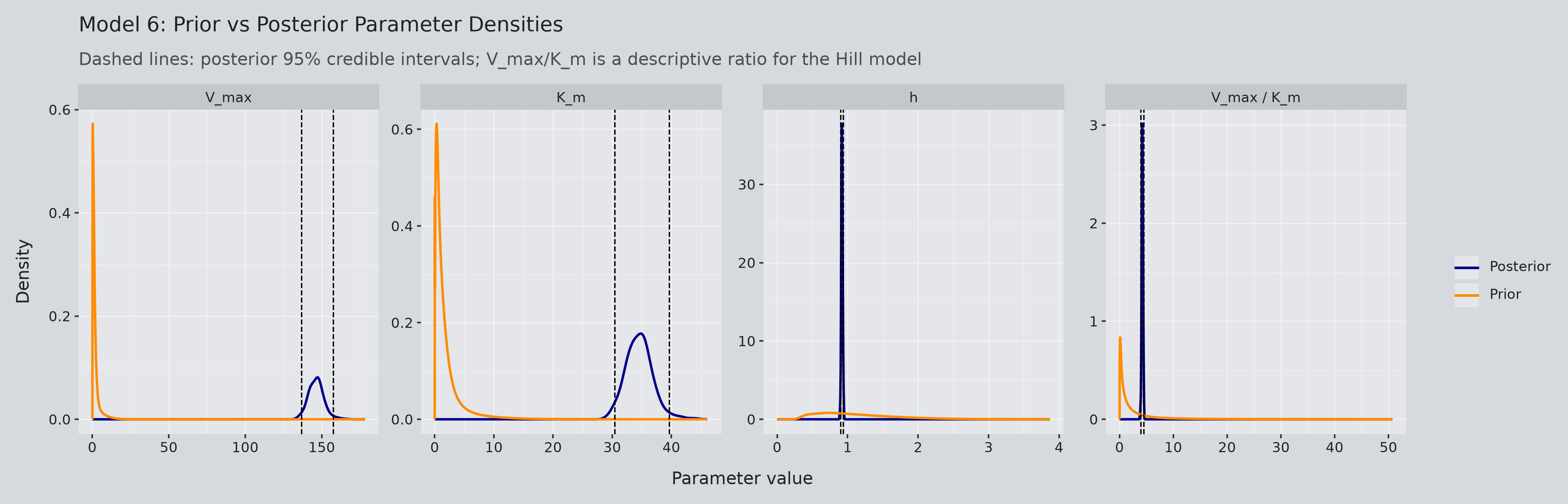
Model 6 interpretation: The \(h\) panel is the one to look at. The prior is centered at 1 and the posterior sits just below it, narrow and clearly shifted. \(V_{\max}/K_m\) looks like Model 5’s, but \(V_{\max}\) and \(K_m\) are each noticeably wider, with relative SD of 3.5% and 6.6% against 1.1% and 1.8%. Adding \(h\) lets the three kinetic parameters trade off, so each is less constrained. The sampling problems make these widths less trustworthy, but the extra parameter is expected to widen them.
9 Using Models 5 and 6 to Estimate Time
9.1 Integrated Michaelis–Menten and Hill Equations
After fitting the concentration curves, I used the integrated equations to estimate the time required to reach a specified product concentration.
Here, \(C_{A0}\) is the initial substrate concentration before the reaction began, while \(C_{B0}\) is the product concentration at the shifted time origin. Consistent with the implemented models:
\[ C_A(t)=C_{A0}-C_B(t), \qquad C_A(0)=C_{A0}-C_{B0} \]
Thus, the substrate remaining at the shifted starting time is \(C_{A0}-C_{B0}\), rather than \(C_{A0}\) itself. This distinction connects the earlier derivation to the initial conditions used in the models.
For Michaelis–Menten kinetics:
\[ t= \frac{ C_B-C_{B0} -K_m\ln\left(\frac{C_{A0}-C_B}{C_{A0}-C_{B0}}\right) }{V_{\max}} \]
For the Hill model, when \(h\ne1\):
\[ t= \frac{1}{V_{\max}} \left[ C_B-C_{B0} + \frac{K_m^h}{h-1} \left( (C_{A0}-C_B)^{1-h} - (C_{A0}-C_{B0})^{1-h} \right) \right] \]
The limit as \(h\) approaches one gives the Michaelis–Menten expression. These calculations use posterior mean parameter values, so they produce point estimates rather than a full distribution of predicted times.
9.2 Correcting Measured Concentrations for the Offset
The integrated equations give \(t(C_B)\), the time at which the true product concentration reaches \(C_B\). The observations are not \(C_B\) directly. From the likelihood, each reading is
\[ y_i \sim \operatorname{Normal}(\mu_i, \sigma), \qquad \mu_i = C_B(t_i) + b \]
So \(y\) is the true product plus the offset plus measurement noise. The quantity I actually evaluate is
\[ \hat t = t(y - \hat b) \]
with \(\hat b\) the posterior mean offset for that experiment. This removes the estimated constant shift but not the noise, so the corrected measurements can still fall outside the kinetic model’s physical range. ## Comparing Predicted and Recorded Times
For each corrected measurement, I calculated a predicted time \(\hat t = t(y - \hat b)\) and compared it with the recorded time on the shifted time axis.
Model 5
Model 6
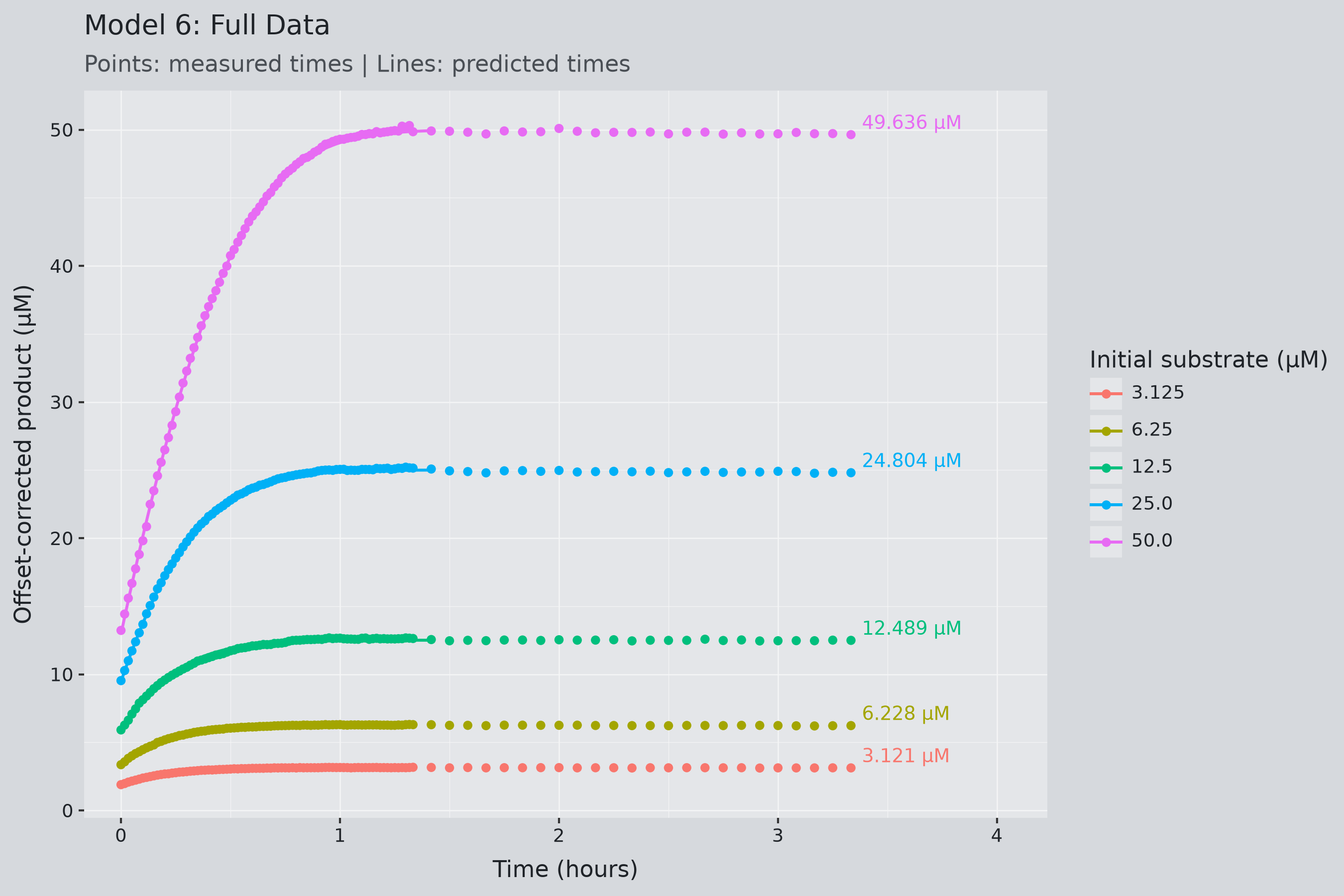
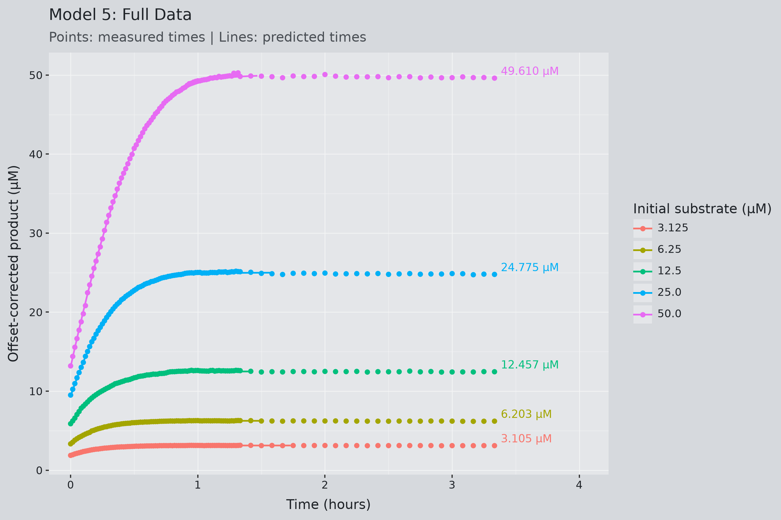
Time prediction plot:
- Points are the corrected measurements at their recorded times.
- Lines are the same measurements at their predicted times.
- If the integrated equation were exact, every point would sit on its line.
- The number at the end of each curve is its final corrected measurement.
I defined the time residual as:
\[ r_t=t_{\mathrm{recorded}}-\hat t \]
The time-based coefficient of determination was calculated as:
\[ R_t^2= 1- \frac{ \sum_j(t_j-\hat t_j)^2 }{ \sum_j(t_j-\bar t)^2 } \]
This measures agreement in time, rather than concentration. Because I also used the observations to fit the models, this is an in-sample consistency check, not an independent validation of future predictions. Measurements whose corrected concentration reached or exceeded \(C_{A0}\) give an infinite or undefined \(\hat t\) and are excluded from \(R_t^2\).
Models 5 and 6 interpretation: The time predictions are horrific for both models, with \(R_t^2\) between 0.14 and 0.49 per curve and 0.28 and 0.31 overall, despite concentration \(R^2\) above 0.9999. Neither model is clearly better. Model 6 loses more rows to infinite predictions (375 kept vs. 432) because its offsets are slightly smaller, leaving more corrected values above \(C_{A0}\). The plots show where the damage is: the lines and points agree early in each curve and come apart as the curve flattens. The next section looks at why.
10 Investigating Errors Near the Plateau
10.1 Why Small Concentration Errors Become Large Time Errors
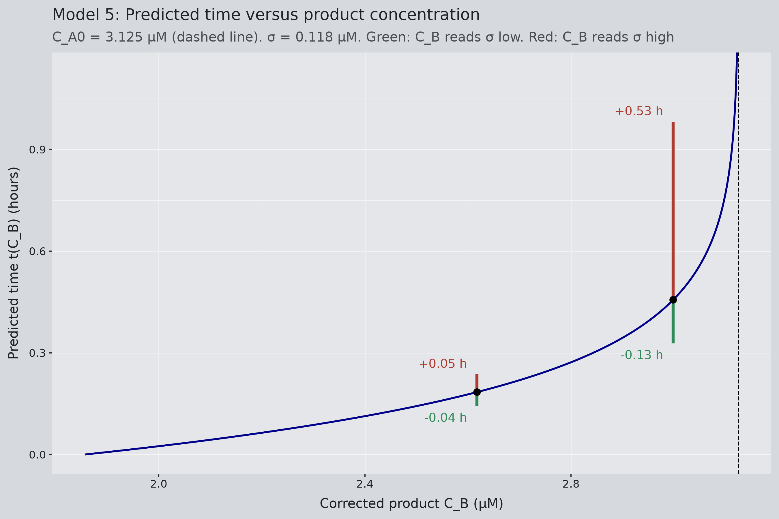
Sensitivity plot: This shows how a small error in the measured product concentration turns into an error in the predicted time.
- The blue curve is \(t(C_B)\), the predicted time to reach a given product concentration, from the integrated Michaelis–Menten equation with Model 5’s posterior means for the 3.125 µM experiment.
- The dashed line is \(C_{A0}\). The curve goes vertical there because the predicted time is infinite when all the substrate is gone.
- Each black point is a true concentration and its true time on the curve.
- The green segment below a point shows how much earlier the predicted time would be if the measurement read \(\sigma\) as \(0.118\) µM too low.
- The red segment above a point shows how much later the prediction would be if the measurement read \(\sigma\) too high.
Model 5 interpretation: At the first point, the two segments are nearly equal. For the second point, the red segment (0.53 h) is four times the green one (0.13 h), because the logarithm grows without bound as \(C_B\) approaches \(C_{A0}\). Reading slightly high near the plateau is far worse than reading slightly low because the curve bends upward toward the asymptote, and the closer the measurement is to \(C_{A0}\), the worse it gets. Measurements near the plateau cannot give usable time predictions no matter how good the concentration fit is.
10.2 Residuals and Rates of Concentration Change
To investigate where the large errors occurred, I added three columns to each time-analysis row: the time residual, the percentage change in corrected product concentration between consecutive measurements, and that change per hour.
\[ \begin{alignedat}{2} r_{t,j} &= t_{\mathrm{recorded},j}-\hat t_j &&\quad (\text{Time residual}) \\[8pt] \Delta_j &= 100\,\frac{C_{B,j}-C_{B,j-1}}{C_{B,j-1}} &&\quad (\text{Concentration change, \%}) \\[8pt] \rho_j &= \frac{\Delta_j}{t_{\mathrm{recorded},j}-t_{\mathrm{recorded},j-1}} &&\quad (\text{Concentration change, \% per hour}) \end{alignedat} \]
Dividing by the elapsed time accounts for differences in measurement spacing and helps identify where concentration is changing slowly. The denominator of \(\Delta_j\) is the previous product concentration, so it is a relative change in product, not a percentage of the initial substrate concentration.
Model 5 interpretation:
- Up to about row 36 (0.6 hours), the predictions are good: residuals are hundredths of an hour or less, and the concentration is still changing quickly.
- From row 37 onward, they are not: \(C_B\) sits within 0.05 µM of \(C_{A0}\), the concentration change flips sign as noise takes over, \(\hat t\) becomes undefined wherever \(C_B\) crosses 3.125 µM, and the final row has a 2.5-hour residual
10.3 Defining the Plateau Cutoff
I removed points using two rules on \(\rho\), the percentage change per hour:
- \(|\rho|\) has to be at or below 10.
- It has to happen on two consecutive readings.
When both conditions are met, I removed the first of those two readings and every subsequent reading from that experiment’s time-analysis subset. A cutoff of 10 means a relative concentration change of at most 10% per hour, not a 10% difference between observations.
This is the most subjective part of the project. I tried different combinations of the threshold and the number of consecutive readings, eyeballed the cut plots, and picked the pair that looked best while keeping the most rows. It is not perfect, but the other combinations did not change the results too much either.
The cutoff did not change the data used to fit the Bayesian models. The original data were preserved, and the cutoff created a separate dataframe for evaluating the inverse time calculation.
10.4 Results Before and After the Cutoff
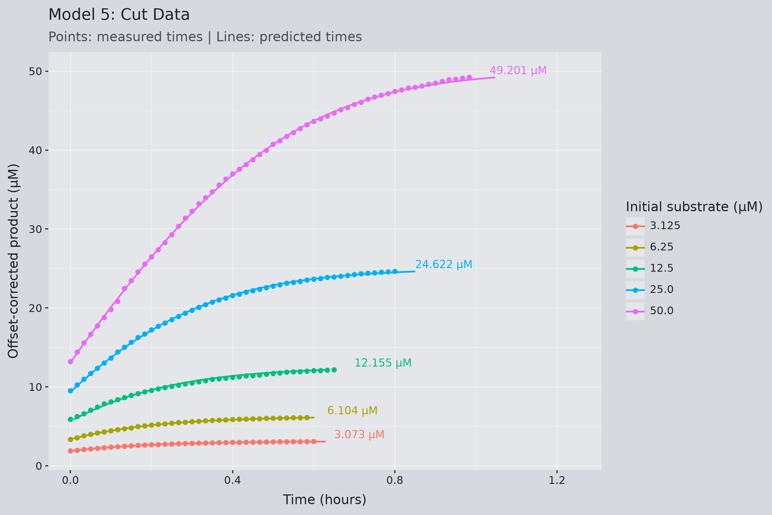
After applying the cutoff, I recalculated the time-based \(R^2\) using finite predictions and recorded how many observations remained in each group.
Model 5
Model 6
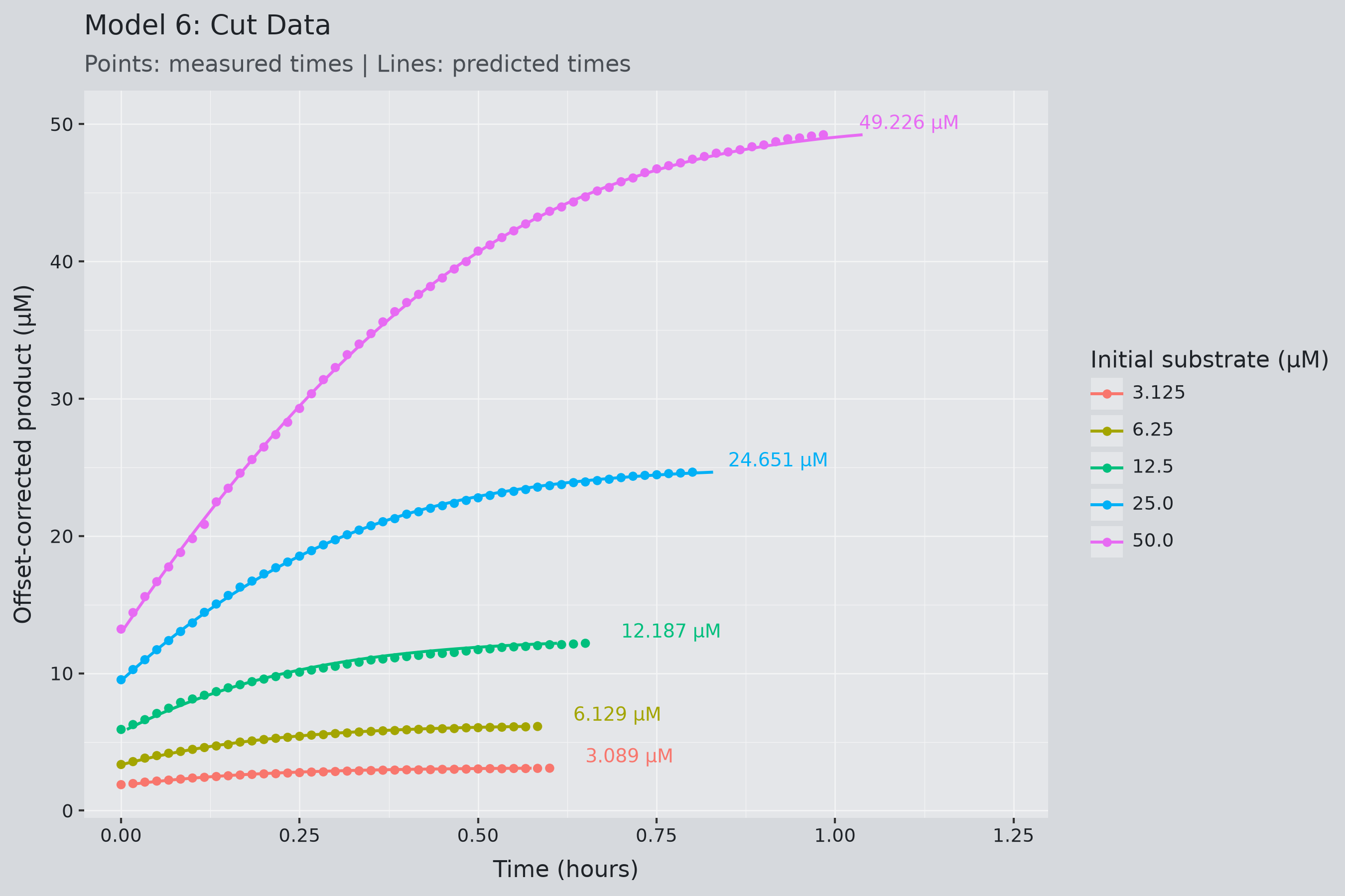
Models 5 and 6 interpretation:
- Even the curve that lost the least still had 43% of its readings removed, and the curve that lost the most had 66% removed. Both models lose the same rows.
- Lower \(C_{A0}\) concentrations lose more because they reach the plateau sooner.
- On what remains, the overall \(R_t^2\) jumps from about 0.3 to 0.996 for Model 5 and 0.992 for Model 6, and every individual curve is above 0.96. Model 5 is now slightly better on four of five curves.
- This does not mean that the predictions improved. The calculation excludes the region where the inverse equation is most sensitive.
11 Evaluating the Cutoff Decision
11.1 Retained Observations and Final Concentration Differences
To see what the cutoff actually costs the model, I compared the last corrected product concentration in each full curve with the last one kept after the cutoff.
For each group, I calculated:
\[ \text{Absolute difference} = \left| C_{B,\mathrm{full,last}} - C_{B,\mathrm{cut,last}} \right| \]
and:
\[ \text{Percentage difference} = 100\frac{ \left| C_{B,\mathrm{full,last}} - C_{B,\mathrm{cut,last}} \right| }{ \left|C_{B,\mathrm{full,last}}\right| } \]
These values show how much the observed endpoint changes when we exclude the late measurements. They compare the last readings, which may not be the largest because of measurement noise.
Models 5 and 6 interpretation:
- Removing 43% to 66% of each curve moves the final concentration by at most 2.4%, and under 1% for the two highest concentrations.
- The absolute differences are identical between the models because both cut at the same rows and the offset cancels in the subtraction. Only the percentages differ, and only in the third decimal.
- The 12.5 µM curve is the outlier at 2.4%. It also has the lowest concentration \(R^2\) in both models.
11.2 Comparing Both Models on the Same Observations
The model-specific offsets can produce different corrected concentrations and cutoff locations. Comparing Models 5 and 6 only on their separately retained subsets could therefore favor a model partly because it was evaluated on different observations.
So I also compared them on the observations both models kept, matched by concentration and recorded time, using only finite predictions.
Models 5 and 6 interpretation: The concern didn’t matter here. Both models cut every curve at the same row, so the matched subset is the full cut subset and the matched \(R_t^2\) equals the cut \(R_t^2\) from the previous section. On identical observations, Model 5 is slightly better.
11.3 Use Case: Picking a Starting Concentration for a Target
Say you want to reach 10 µM of product and can start from 12.5, 25, or 50 µM. The prediction works only if the target falls within the part of the curve the cutoff kept.
- 50 µM: hits 10 µM during the first ten minutes, before the reaction has stabilized. The models were not fitted to that period, so there is nothing to predict from.
- 25 µM: hits it less than a minute into the usable data. Technically inside, but barely.
- 12.5 µM: hits it at about 14 minutes, comfortably inside the kept region, with an uncertainty of about half a minute.
Starting high is fast but can blow past the target before you can see it. Starting low is slow but gives you a measurable window, at the cost of being closer to the plateau. Choose based on whether speed or resolution matters more, and first check that the target falls within the kept region.
12 Conclusions and Limitations
12.1 What the Project Demonstrated
This project fitted Michaelis–Menten kinetics to enzyme progress curves with Bayesian inference, testing how initial conditions, measurement offsets, and shared parameters affect the result.
Model 5 fits all five substrate concentrations, with \(V_{\max}\) and \(K_m\) each determined within 2% and within about 9% of the article’s independently fitted values. The Hill extension in Model 6 did not improve the fit and could not be sampled properly on my hardware, so Model 5 is the clear winner of the six.
12.2 Were the Project Goals Achieved?
What are the Michaelis–Menten parameters, and how uncertain are they? Yes. Model 5 gives \(V_{\max} = 118.9 \pm 1.3\) µM/hour and \(K_m = 23.1 \pm 0.4\) µM, with full posteriors rather than point estimates, and the values sit within about 9% of the article’s.
Can those parameters predict the time to reach a target concentration? Partly. The prediction is reliable while the reaction is still moving, but it breaks down near the plateau, where ordinary measurement noise turns into hours of time error. So the answer is yes for targets before the plateau, and no for targets close to \(C_{A0}\). The practical workaround is to choose a starting concentration that puts the target in the usable window.
12.3 What Still Requires Validation
I checked everything against the same data the models were fitted to. Whether the models hold up in new experiments, how much the priors matter, and whether a constant offset and independent noise are good enough assumptions remain open questions.
The time predictions use single best-guess parameter values. Running the full posterior through the time equation instead would give each prediction an uncertainty range.
I tuned the plateau cutoff using these data, so the improved \(R^2\) after cutting partly reflects that tuning. It should be tested on data it was not designed around.
12.4 Bayesian Statistics in Other Fields
Nothing here is specific to enzymes. The same workflow applies wherever a field already has a trusted model and noisy data to fit it to:
- Pharmacokinetics
- Epidemiology
- Chemical and process engineering
- Economics and finance
- Ecology
- Physics and astronomy
- Sports analytics
The payoff is the same in each case. You get a distribution for each parameter instead of a point estimate, and the diagnostics tell you when the sampler or model is failing, while the predictive checks show where the model’s assumptions stop holding, as the plateau did here.
Thumbnail icon from Magnific from Flaticon
Thumbnail icon from Magnific from Flaticon