RGGI CO₂ Emissions: An Exploratory Analysis

R
Data Science
Chemical Engineering
Author

Mohammad Savarmand

Published

2026 May 25

Problem Formulation

I aim to demonstrate that I can access public environmental data, process it efficiently, and produce meaningful visualizations that reveal patterns in CO2 emissions across RGGI-participating states.

The data comes from the RGGI COATS public reports page, which provides quarterly emissions data for power plants across 12 states. My goal is not to answer a specific hypothesis, but to show that I can:

  1. Extract and clean data from Excel reports
  2. Aggregate and transform it at various levels (state, source, time)
  3. Generate visualizations that surface real patterns

Data Import

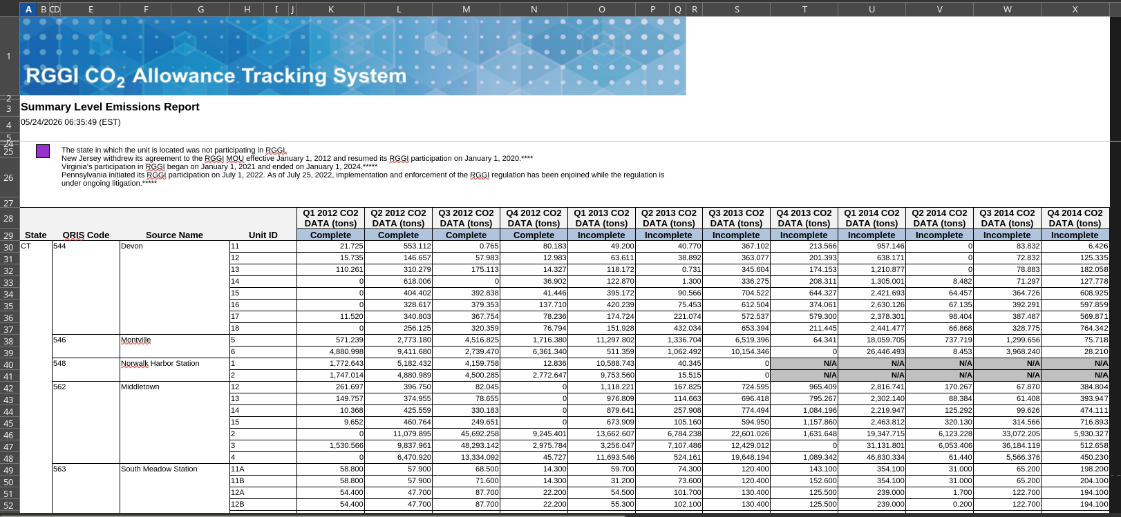
Going through the website I manually downloaded the reports which looked like this:

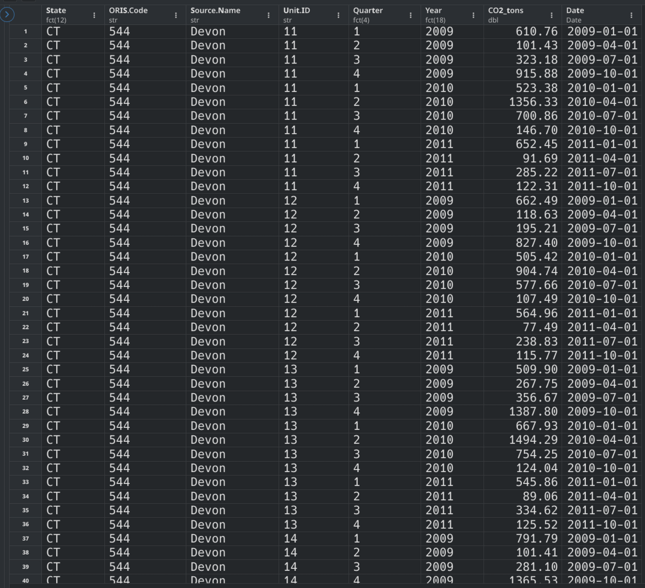
and transformed it into a tidyverse friendly dataframe as shown:

Code
library(tidyverse)
library(readxl)
library(lubridate)

read_rggi_report <- function(report_path){
  df_names_groups <- read_excel(report_path, 
                 skip = 28,
                 col_names = FALSE,
                 n_max = 1
                )[,c(1,4,6,8)] %>% 
                as.character(t(.))

  df_names_data <- read_excel(report_path, 
                 skip = 27,
                 col_names = FALSE,
                 n_max = 1
                )[,-c(7,8)] %>% 
                as.character(t(.))

  df_names_all <- c(df_names_groups,df_names_data)
  df_names_all <- make.names(df_names_all)

  df_values_data <- read_excel(report_path, 
                 skip = 29,
                 col_names = FALSE,
                 n_max = 999-29
                )

  df <- df_values_data %>% 
    select(where(~ !all(is.na(.)))) %>% 
    setNames(df_names_all) %>% 
    fill(df_names_all[1:4], .direction = "down") %>% 
    mutate(across(where(is.character), ~ na_if(.x, "N/A"))) %>% 
    mutate(across(-c(1:4), as.numeric))

  df_long <- df %>% 
    pivot_longer(-c(1:4),
                 names_to = "Time_Q._Y.",
                values_to = "CO2_tons") %>% 
    mutate(Time_Q._Y. = str_remove(Time_Q._Y.,"\\.CO2.*")) %>% 
    separate(Time_Q._Y., 
            into = c("Quarter", "Year"), 
            sep = "\\.",
            remove = TRUE) %>% 
    mutate(
      Quarter_num = case_when(
        Quarter == "Q1" ~ 1,
        Quarter == "Q2" ~ 4,
        Quarter == "Q3" ~ 7,
        Quarter == "Q4" ~ 10,
      ),
      Date = make_date(as.numeric(Year),Quarter_num,1)
    ) %>% 
    mutate(
      Year = as.factor(Year),
      Quarter = str_remove(Quarter,"Q"),
      Quarter = as.factor(Quarter),
      State = as.factor(State)
    ) %>% 
    select(-Quarter_num) %>% 
    filter(!is.na(CO2_tons))
  
  return(df_long)
}

report_list <- list.files(path = "data/", pattern = "\\.xlsx$", full.names = TRUE)
df_names <- str_extract(basename(report_list), "\\d{2}-\\d{2}")

df <- lapply(report_list, read_rggi_report) |> 
  setNames(df_names) |> 
  bind_rows()

df |> glimpse()

Visualizations

State-Level CO2 Emissions Over Time (Column Plot)

Using that as the dataframe to work from I created a series of column graphs faceted by State to get an idea of what RGGI’s CO2 emissions look like in general.

Code
state_agg <- df |> 
  group_by(State, Date) |> 
  summarise(CO2_tons_sum = sum(CO2_tons, na.rm = TRUE), .groups = "drop")

ggplot(state_agg, aes(x = Date, y = CO2_tons_sum)) +
  geom_col(fill = "steelblue") +
  facet_wrap(~ State, scales = "free_y", ncol = 4) +
  labs(
    title = "State-Level CO2 Emissions Over Time",
    x = "Date",
    y = "CO2 (tons)"
  ) +
  theme_minimal(base_size = 11) +
  theme(
    plot.title = element_text(face = "bold", size = 14),
    axis.text.x = element_text(angle = 45, hjust = 1)
  )

Looking across the 12 states, several patterns emerge:

  • NY seems to have the largest consistent emissions relative to others, followed by MD, MA, and NJ.
  • When PA’s CO2 emissions were recorded, they skyrocketed past everyone else for that year.
  • The others have low emissions, most likely due to RGGI not having committed as many detectors in those areas. It is hard to believe VT had almost zero emissions, so it is probably due to a lack of sufficient data

Distribution of Emissions by State (Boxplot)

Code
upper_limits <- df |> 
  group_by(State) |> 
  summarise(upper = boxplot.stats(CO2_tons)$stats[5]) |> 
  pull(upper) |> 
  max(na.rm = TRUE)

pct_labels <- df |> 
  group_by(State) |> 
  summarise(
    median = median(CO2_tons, na.rm = TRUE),
    q75 = quantile(CO2_tons, 0.75, na.rm = TRUE),
    n = n()
  ) |> 
  mutate(
    pct = n / sum(n) * 100,
    y_pos = (median + q75) / 2
  ) |> 
  arrange(pct) |> 
  mutate(State = factor(State, levels = State))

df <- df |> 
  mutate(State = factor(State, levels = pct_labels$State))

ggplot(df, aes(x = State, y = CO2_tons)) +
  geom_boxplot(outlier.shape = NA) +
  geom_text(
    data = pct_labels,
    aes(label = paste0(round(pct, 1), "%"), y = y_pos),
    size = 3
  ) +
  coord_cartesian(ylim = c(0, upper_limits)) +
  labs(
    title = "Distribution of CO2 Emissions by State with Relative Share",
    x = "State",
    y = "CO2 (tons)"
  ) +
  theme_minimal(base_size = 12) +
  theme(
    plot.title = element_text(face = "bold", size = 14),
    axis.text.x = element_text(angle = 45, hjust = 1)
  )

The boxplot confirms the state-level hierarchy: New York, Massachusetts, and New Jersey make up most of the data the rest contribute very little. Pennsylvania is interesting because of the magntidude of the CO2 emmissions rather than the amount of data points recorded.

Source-Level Breakdown for Selected States

Code
source_top <- df |> 
  filter(State %in% c("NY", "NJ", "PA", "MA")) |> 
  group_by(State, Source.Name, Date) |> 
  summarise(CO2_tons_sum = sum(CO2_tons, na.rm = TRUE), .groups = "drop")

ggplot(source_top, aes(x = Date, y = CO2_tons_sum)) +
  geom_col(fill = "steelblue") +
  facet_wrap(State ~ Source.Name, scales = "free_y", ncol = 4) +
  labs(
    title = "Source-Level CO2 Emissions Over Time",
    x = "Date",
    y = "CO2 (tons)"
  ) +
  theme_minimal(base_size = 9) +
  theme(
    plot.title = element_text(face = "bold", size = 14),
    axis.text.x = element_text(angle = 45, hjust = 1),
    strip.text = element_text(size = 7)
  )

Looking at New York, most sources of CO2 measurements show clear ups and downs over time. With a more specific question and a focused goal, these column graphs could reveal a lot about what drives those fluctuations.

New Jersey shows considerable missing data. That said, the available records are fairly consistent and lack any dramatic fluctuations.

Surprisingly, Pennsylvania, the state with the most dramatic peak in emissions, actually looks relatively uniform across most of its sources. However, Conemaugh and Keystone both have concerning spikes during certain periods. Those would be natural starting points for an investigation into what caused the sudden rise in emissions and what could be done to address them.


Conclusion

This demonstrates the value of public data. With a clear objective, it can serve as a powerful foundation for analysis and decision-making.

This analysis confirms that I can access public emissions data from RGGI, process it through a clean R pipeline, and produce informative visualizations at multiple levels of aggregation, from state totals down to individual power plant sources.

There are a lot of avenues one could take from here. With a clearer question or more context, I could dig deeper into:

  • Trend analysis: Which states are reducing emissions over time and which are increasing?
  • Seasonal patterns: Do certain quarters consistently show higher emissions?
  • Source-level anomalies: What caused the drop at Somerset around 2015?
  • Policy impact: Did RGGI participation correlate with emissions reductions for newer member states?
  • Forecasting: Can we predict future emissions based on historical patterns?

Without a specific goal or stakeholder question, there is not much more I can do in a targeted way. But I have confirmed that the data is accessible, the pipeline works, and I can go from raw Excel files to publication-ready visualizations quickly. That is the important part.

Thumbnail icon from Freepik